Wednesday, January 19th, 2022 by Hamidreza Zallnezhad
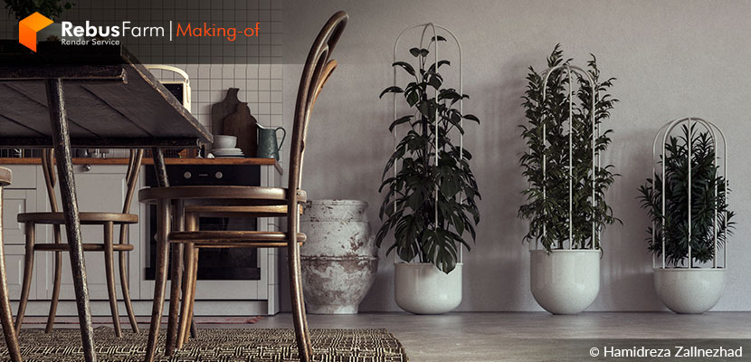
Representing someone's personality with interior design is something we definitely consider true art. Hamidreza Zallnezhad, commonly known as Zazall, tells us the story of how he perfectly brought his client's iconic passion into a design that served for a beautiful, interesting, and aesthetic home.
Let's hear some more of the story behind 'Casa Feliz'.
A brief introduction of me
My name is Hamidreza Zallnezhad. About 10 years ago, I got my bachelor's degree in civil engineering, but I felt that my soul was more for creation, and on the other hand, I liked things related to building. I started learning within the CG industry in 2011 and, as you all know, entering any new space brings a lot of many problems.
In recent years, with a lot of practice and effort, I was able to get the attention of employers outside my place of residence, and my professional activity has been going well for almost 2 years now.
Working with different employers, each living in a different country and with very different cultures is very exciting and poses different challenges.
Here I want to explain the process of modeling and creating these renderings.
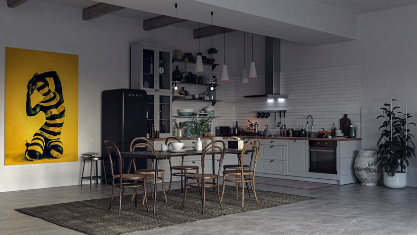 Casa Feliz.
About the project
This is a 55 square-meter condo apartment located in Downtown Tavira, Portugal. The employer of this project (Cäcilia) is a person who was introduced to me by a friend. The photos of the current situation she submitted to me showed a cold, soulless, and very old atmosphere, which was a challenge to transform.
She is a 28-year-old girl who is very active and passionate about sex. One of the most important requirements for the arrangement of this house was to show a space full of sexual feelings in every corner of it.
Unfortunately, this house did not have the ability to be demolished or any other construction work, so we had to act according to the art of arrangement based on the current space of the house, and we could only sand the floor and paint the walls with Kenites.
Idea and inspiration
I always get in the habit of talking to my employer for a few hours before starting a project and learning about his or her tastes and interests. I believe that the more I know, the easier it is for me to meet the demands of the employer in the project.
One of my biggest challenges was the Portuguese language, which unfortunately I did not master at all, but I was able to get help from a friend who introduced this lady, and I can say that she translated all the feelings and wishes of my beautiful employer and gave them to me.
After 38 hours of examining all aspects of the existing environment and the main needs of the employer, I began to arrange and design and select materials that can be easily provided.
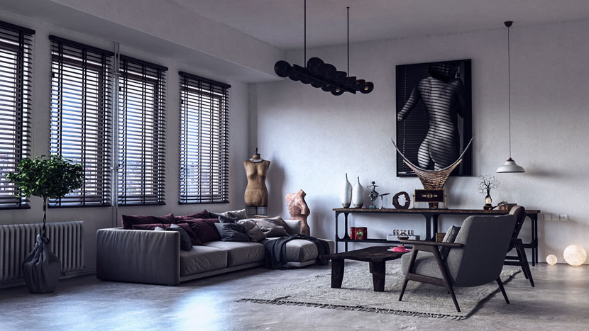 Casa Feliz, living room.
Design
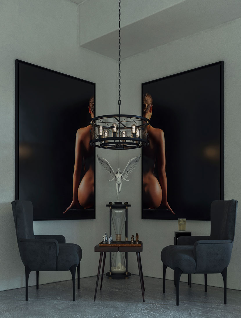
At first, I asked Cäcilia about home and who she usually invites to her house, she expressed her interest in chess-playing with her best friend and nude images on walls.
She wanted a comfortable place, with a rustic kitchen, and a lot of intimacy.
One of the things Cäcilia emphasized was that she did not want a place for TV at all and had no interest in watching it, preferring to spend her free time photographing and reading on the sofa. Cäcilia is very interested in the care of plants and she preferred the house to be full of plants but not to the extent that it was out of note whit its original beauty and main elements.
 .
.
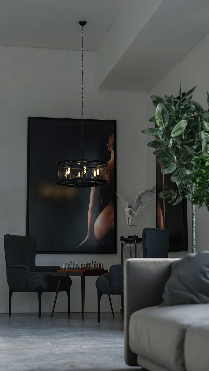 Casa Feliz, living room.
Modeling
Usually, with the right information, the best result can be easily achieved. First, the whole house was modeled according to the dimensions given by Cäcilia, then, the placement of elements that were immutable, such as doors and windows. Then I started defining the initial spaces and etudes in AutoCAD software and sent it to Cäcilia, who approved it and said it was exactly what she wanted.
I started modeling the kitchen and the dining sofa and all the basic household items.
For details and furniture, I used ready-made models, which I usually use from Evermotion products.
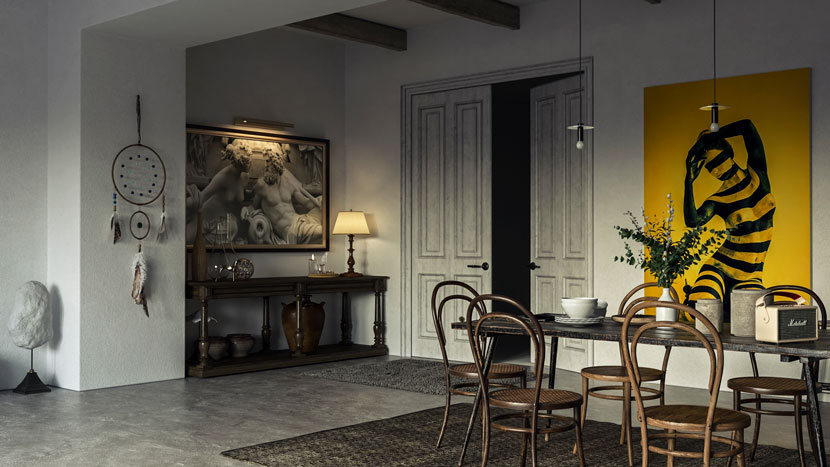 Furniture with ready-made models.
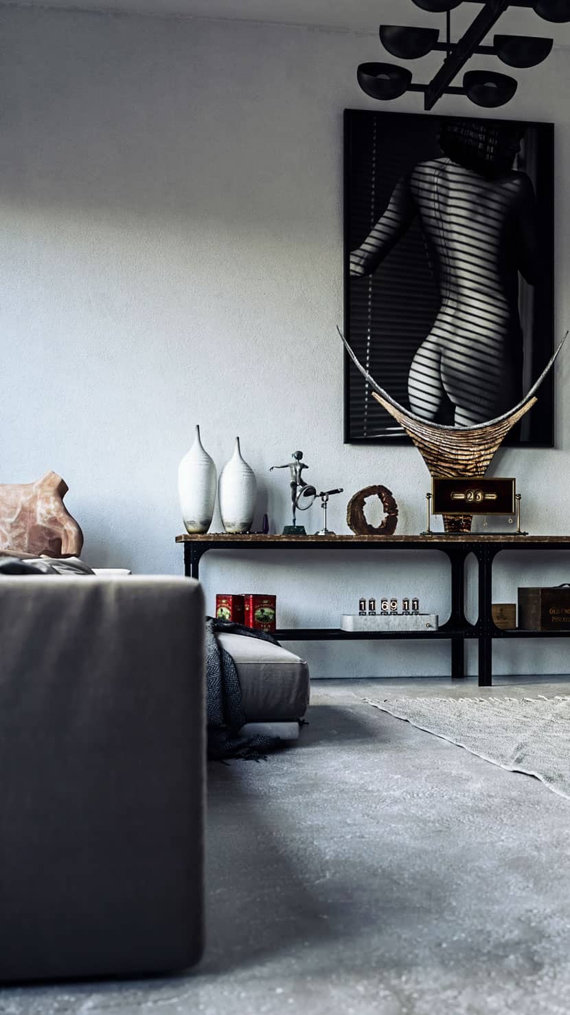 Decorative details.
Texturing
The most basic part of creating a realistic render is making materials.
I do not use ready-made materials in any of my works at all and I believe that all materials have their own characteristics for each space and I have to make them with great care and obsession.
I use PBR materials that I usually download from CGAxis, Poliigon, and Quixel Bridge sites, but we have to keep in mind that it may take me 3 hours to build a wall material that uses Kenites here. To convey that real feeling to the viewer.
I use the imported textures into related material channels within V-Ray materials like diffuse (albedo), metallic, displacement, roughness, normal, emissive, etc.
In addition to making materials, using the unique feature of 'Unwrapping' helps me a lot in creating a special material, I am always used to using this feature in all my work.
All materials used in this scene are standard V-Ray raw materials that are in the form of chains in V-Ray materials if the object has multiple surface properties.
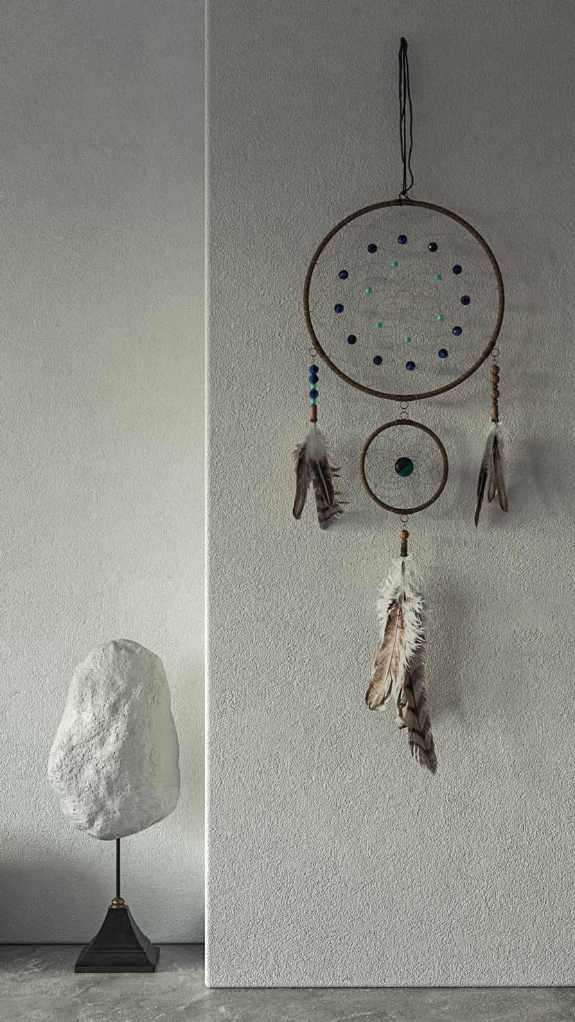 Materials made in V-Ray.
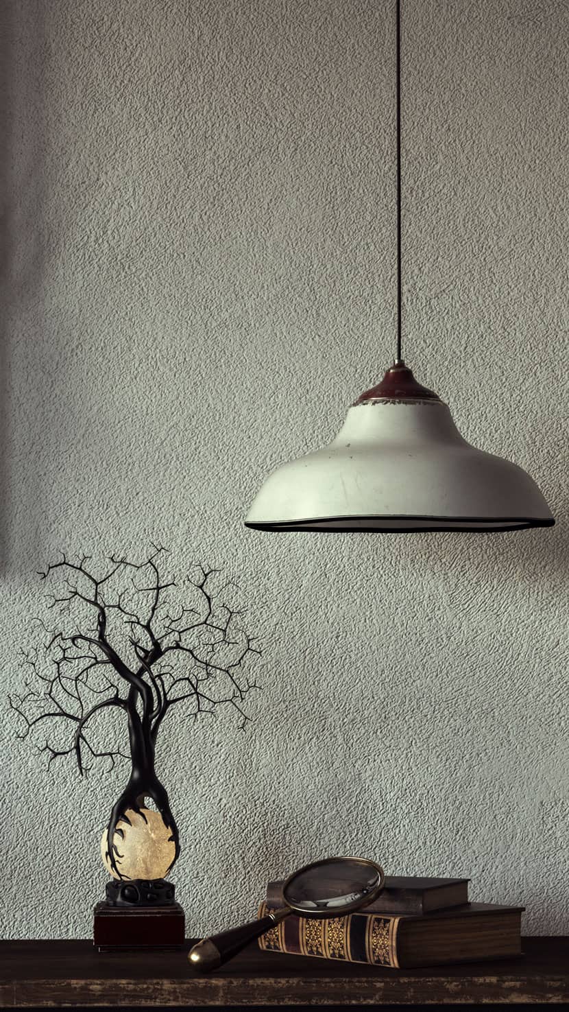 Detailed materials.
Lighting
Light is very important for real results, so real-world light sources were imitated from photos.
The reference is used to apply various lighting techniques in V-Ray, such as HDRI for the environment, 'sphere' for chandeliers, 'rectangle' for windows.
I used two models of rectangular lights behind each window:
1- V-ray light, a model that distributes light to the environment (this model of light has a great effect on making the renderings more realistic).
2- Simple light from V-ray model.
Behind the window, at a distance of about 30 meters, I placed a page that is a photo of a city view of Tavira and gave it an emissive material so that I could make the desired lighting of the outdoor space more realistic.
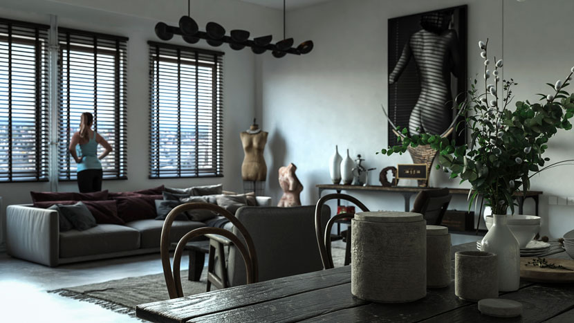 Living room with outside lighting.
Rendering
I used version 5 V-Ray with Brute Force and Light Cache setting for rendering. I did not use any special settings or tricks, I chose most of the standard settings. V-Ray just calculated everything for me, all I had to check was the color threshold (0.001) and the Light Cash sub-divs (I set it to 2850).
To get better rendering in less time, I used Denoiser and Light Mix feature in rendering elements. It is a very powerful feature in creating rendering.
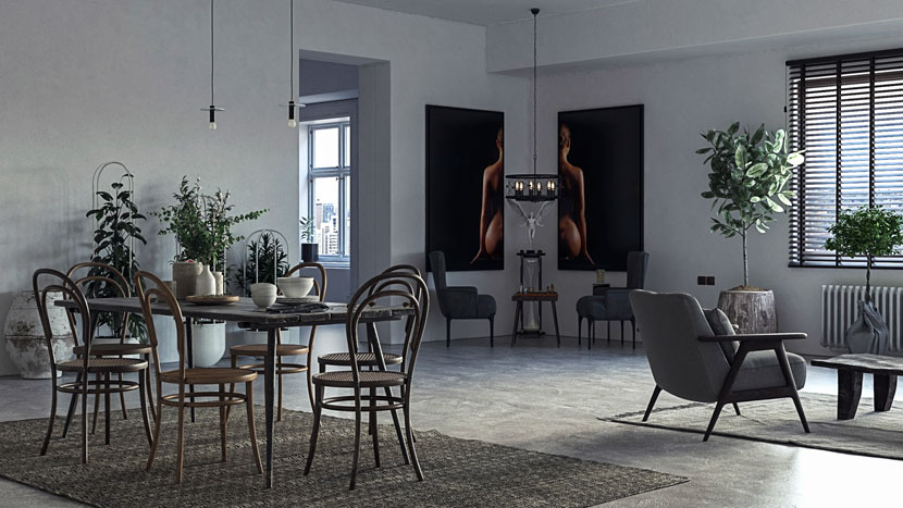 Rendered, 'Casa Feliz'.
Another thing to note is the depth of field (DOF), as it is rendered directly from the V-Ray camera. One of the most beautiful effects in real and virtual cameras is this wonderful feature that makes the images very captivating and attractive, which I used in several renderings.
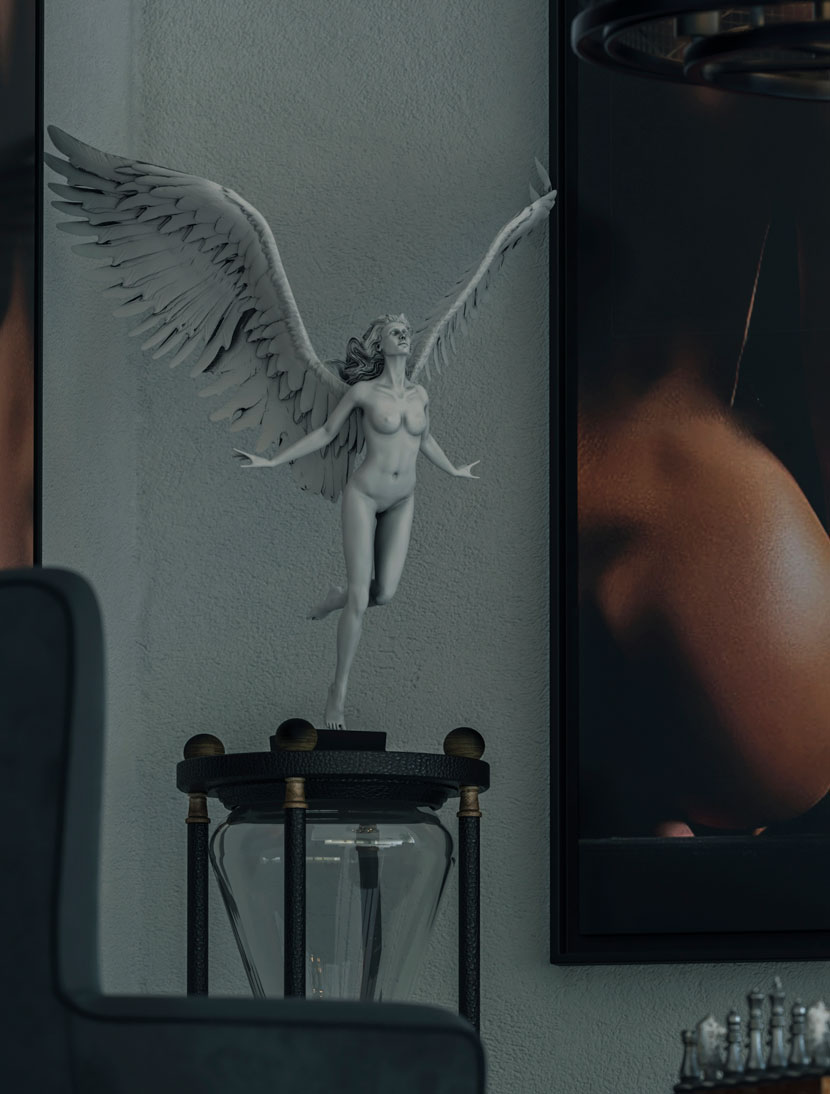 Sculpture with DOF effect.
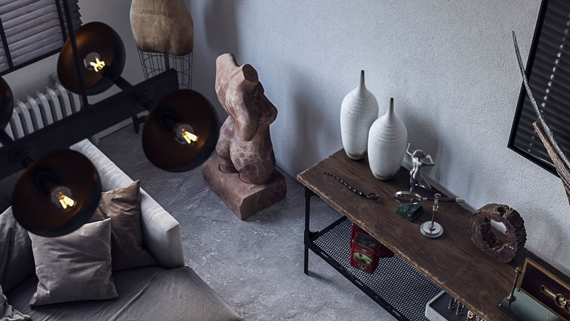 Decorative elements.
Post-Production
To do this, I used two software, Photoshop and Lightroom software. I'm always used to doing my best to get all the effects right in V-ray because then I can get the best output in Photoshop and Lightroom. Somehow I was able to do that and I'm very happy with how attractive the renderings are.
All I really did after production was add a little color and shine, as well as minor color corrections.
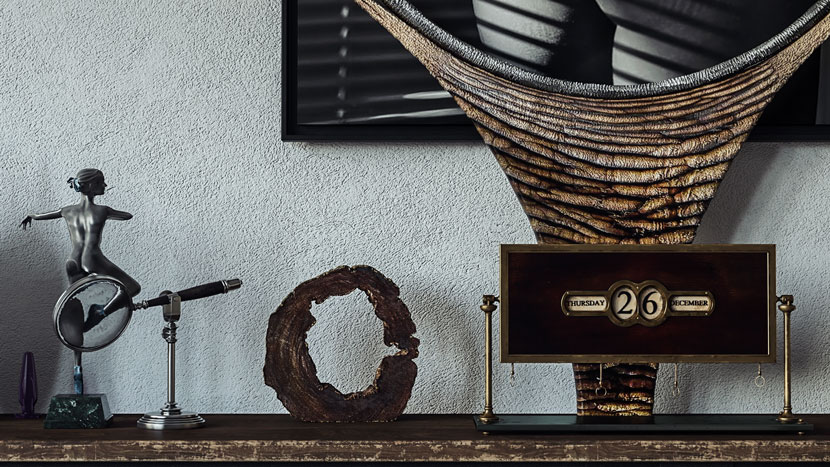 Color and shine details.
I used AutoCAD, 3ds Max, V-ray Renderer, Lightroom and Photoshop, Marvelous Designer (I only used this software for fabric on the kitchen table, which also gave the composition a special beauty). I've gained an appreciation for any software I have, they complement each other well.
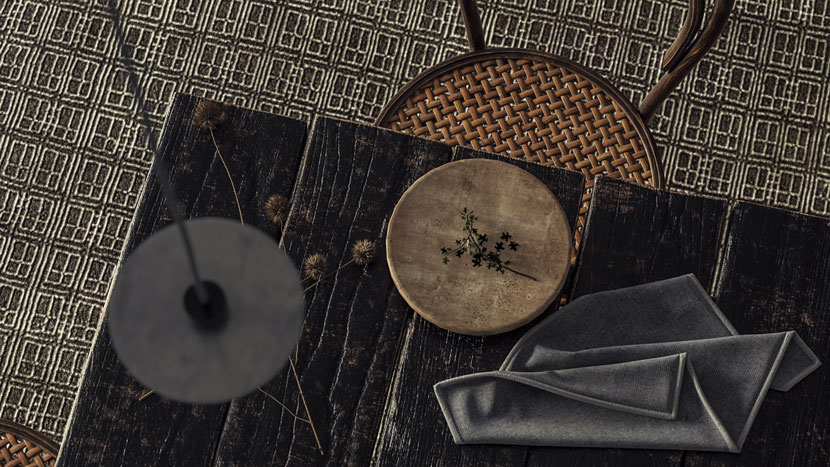
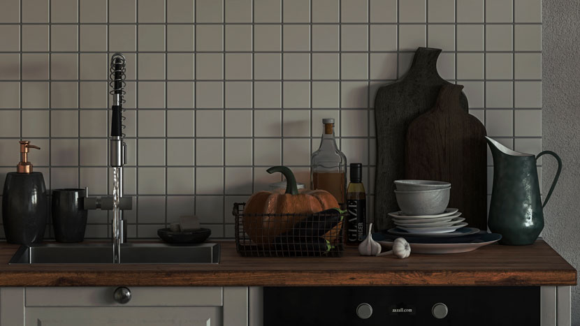
Storytelling
This is the part that sums up the whole process, the renderings have to tell a story, and this is where the power of a truly talented CGI artist comes into play. I believe that an artist, in addition to producing extraordinary renderings, must have an understanding of the environment and the arrangement and composition of colors and that he can choose the right color palette according to the client's interest to convey exactly the pleasant feeling.
All of the above elements are tools that help you in this process. You are either showing a dramatic play, inviting bright space, or telling an exciting story.
This project includes "26 renders" taken from all angles and I tried to create a special place where the employer feels completely present in the space when she sees the renderings.
Another question for Cäcilia was how these spaces look at night, and with the unique feature of version 5 V-Ray, I was able to get high-quality night renders.
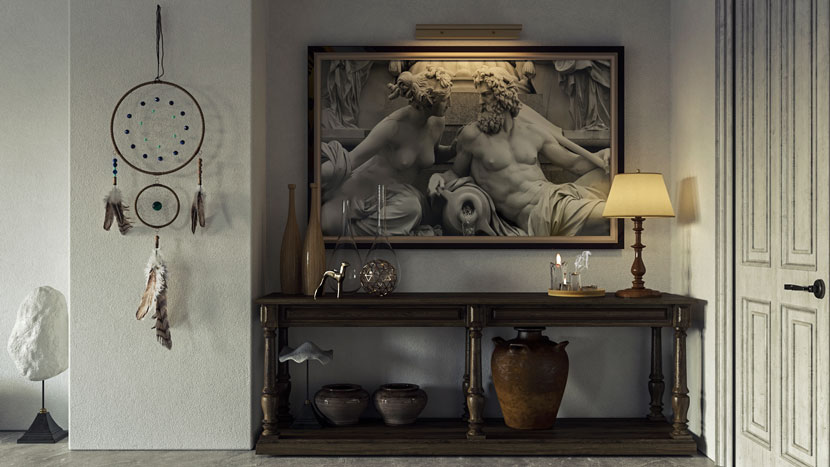 Daylighting.
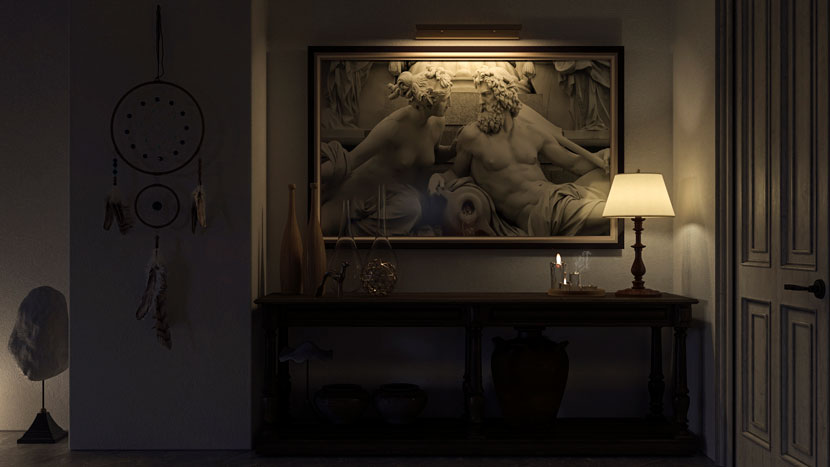 Night lighting.
I am now completely satisfied with the result. Thanks for reading. Do not forget that you should always keep yourself updated and always read articles and always get training, make sure there is enough to learn every day.
In this world that is evolving every moment, you have to make the best use of seconds.
Good luck my dear friends.
We thank Hamidreza for sharing his tips and tricks with our Rebus community. Check out more of his work on his different channels:
Want to share your work with our community too?
Contact us at This email address is being protected from spambots. You need JavaScript enabled to view it.and tell us about your favorite project.
>> Read more articles on our blog
