Friday, January 14th, 2022 by Victoria Shegai
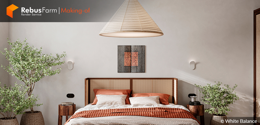
Mixing styles and inspirations is Victoria Shegai's thing. In this 'Making-of' edition, she shares with us how she came to develop this beautiful and modern, yet traditional bedroom.
Let's dive deep into this Japanese-inspired rendered work of art.
Let's hear what Victoria has to share with us!
Hello, my name is Victoria Shegai, I am an interior designer and CG artist. I am part of the White Balance render team. The tools I use in my work are 3ds Max and Corona Renderer.
I started my way to 3d graphics in 2017, from the second year of university. The first software I started to learn was SketchUp and for rendering I used Lumion. I started studying 3ds Max in the 3rd year and it was very difficult for me. To master this software, I took courses and got a job in a visualization studio. This is how my path as a visualizer began, and I've been working as a CG artist for 3 years now.
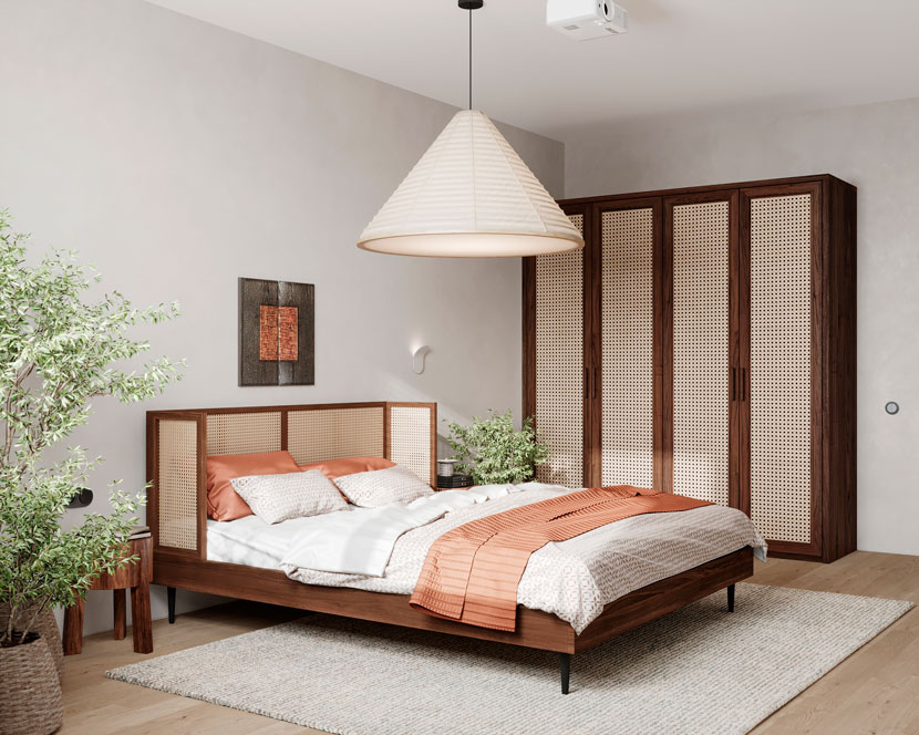
About the project
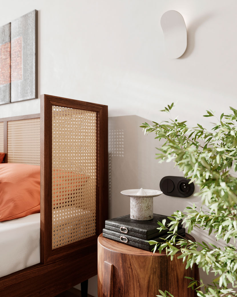
This project is a concept. Lately, I have been very inspired by the Wabi-sabi style. I like the simplicity of the interiors, natural materials, and the minimum amount of furniture. I am also inspired by the Japanese style of the interior and I wanted to mix these two styles. In the project, I used natural materials and bright accents of terracotta in fabrics and leather. I wanted to convey the sunny autumn mood, this is how this project was born.
Modeling
Modeling of the room starts from basic shape or CAD drawing. I create vertices in places where doors and windows are supposed to be. After that, I use the Extrude modifier to set the height and shell modifier to add thickness to the walls. Using the connect tool I form door and window openings. To create a floor I use the FloorGenerator plugin, then I merge the models to complete the geometry of the scene.
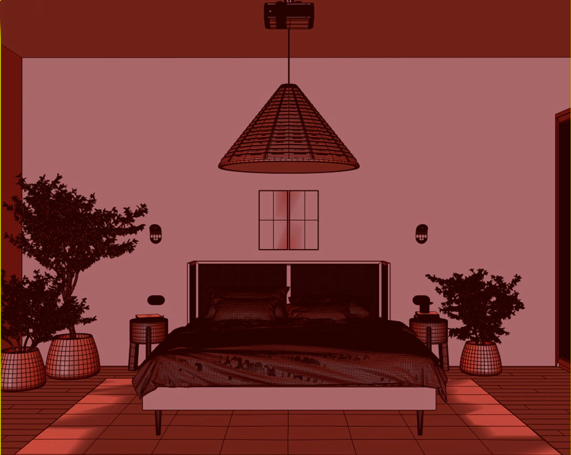 Completed scene geometry
Lighting
For the lighting, I chose the Corona Sun+Sky scheme. In this scene I used 3 suns for different cameras, this allowed me to make different lighting scenarios.
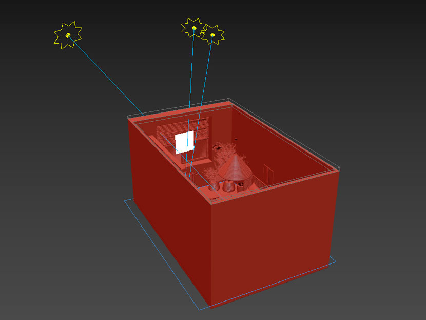 Corona Sun and additional Corona light location
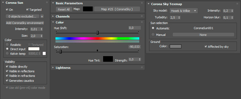 Corona Sun and Sky settings
Corona sky map is desaturated with the color-correction map to avoid affection to the colors of the scene. In addition to the lighting, I placed a fake light after the window. That gives me the desired result.
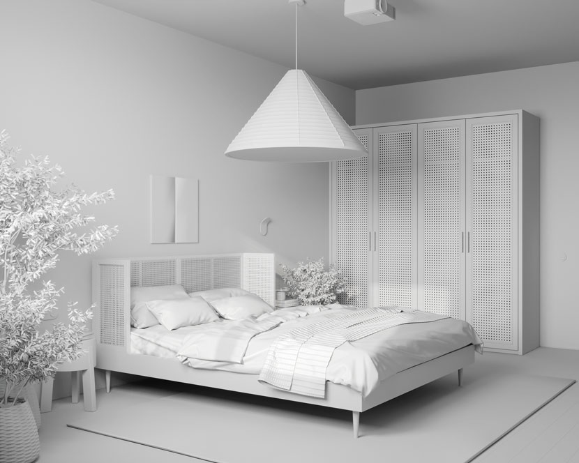 Lighting test.
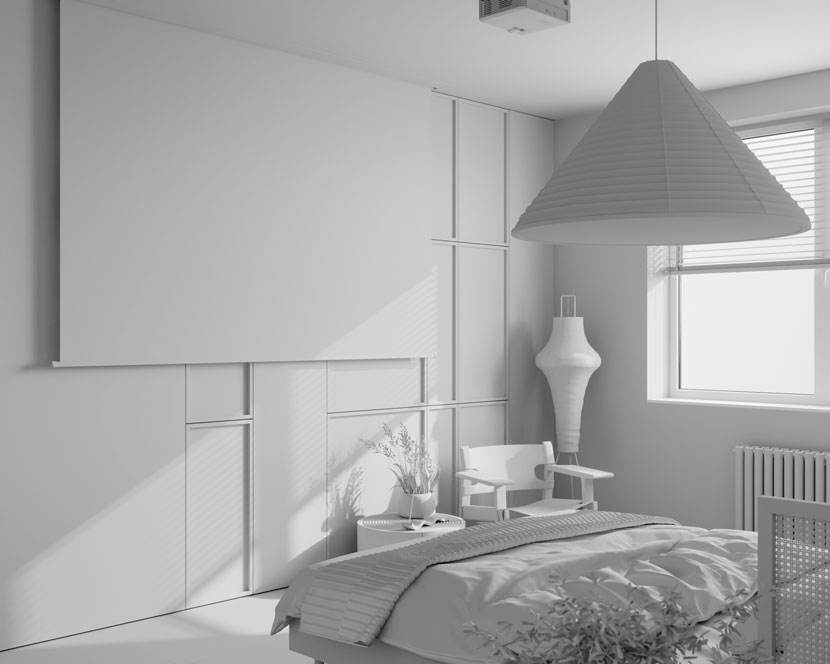 Lighting test.
Textures and materials
As for texturing I use simple techniques and methods to create the material I need. Some materials come with merged models which I give just a little tweaking. In some cases, I use Corona RaySwitch to avoid color mapping.
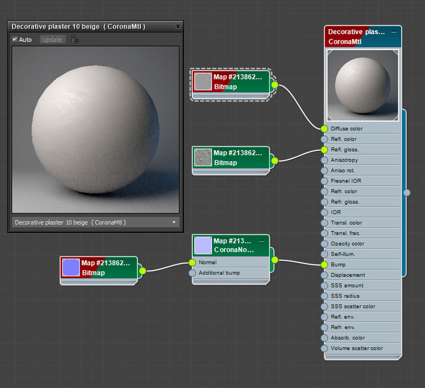 Example: wall material.
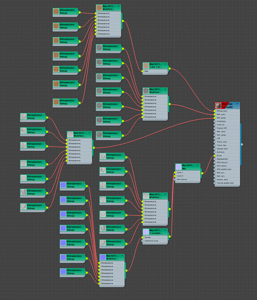 Example: floor material.
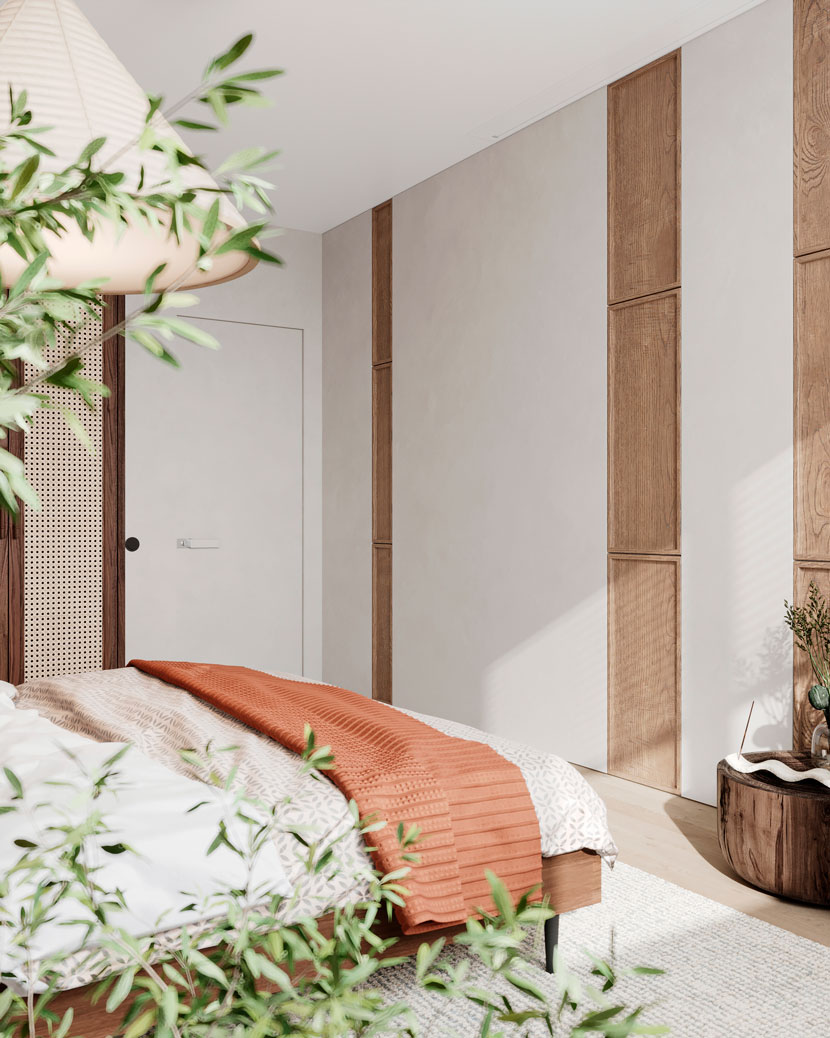 Test rendering with materials.
Image projection on the screen is a corona layered material. The base layer is a white screen material and the second layer is a corona light material with low intensity mixed by mask bitmap.
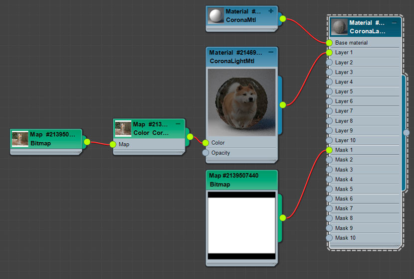 Screen with projection material.
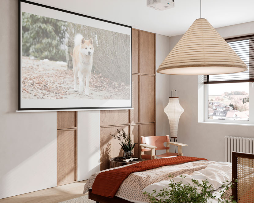 Screen with projection material, render.
Render settings
Nothing special here - all by default, I just set the noise limit to 3% and activated denoising.
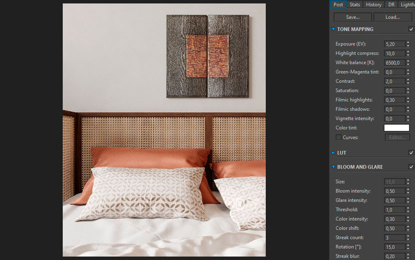 Tone mapping settings
Post-production
In the post-production stage, I use Adobe Photoshop where I add sharpness to my picture and do some tweaks in the camera raw filter. Also, I put the background and apply some effects like smoke.
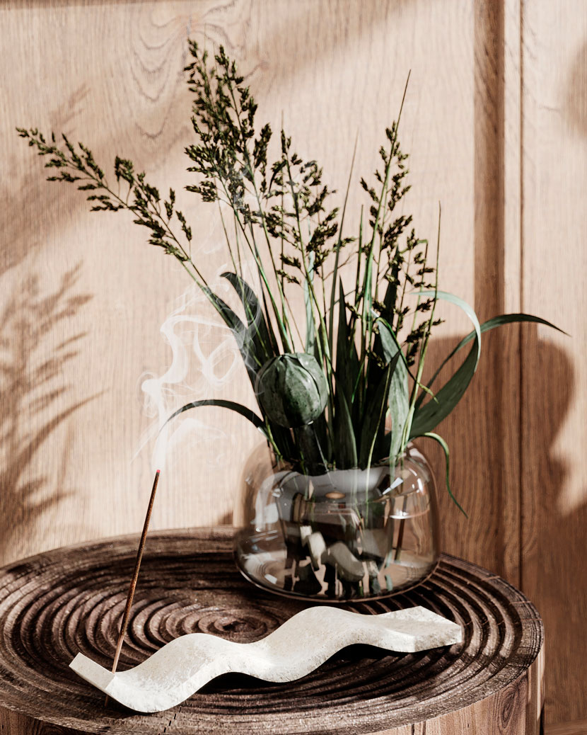 Smoke effect.
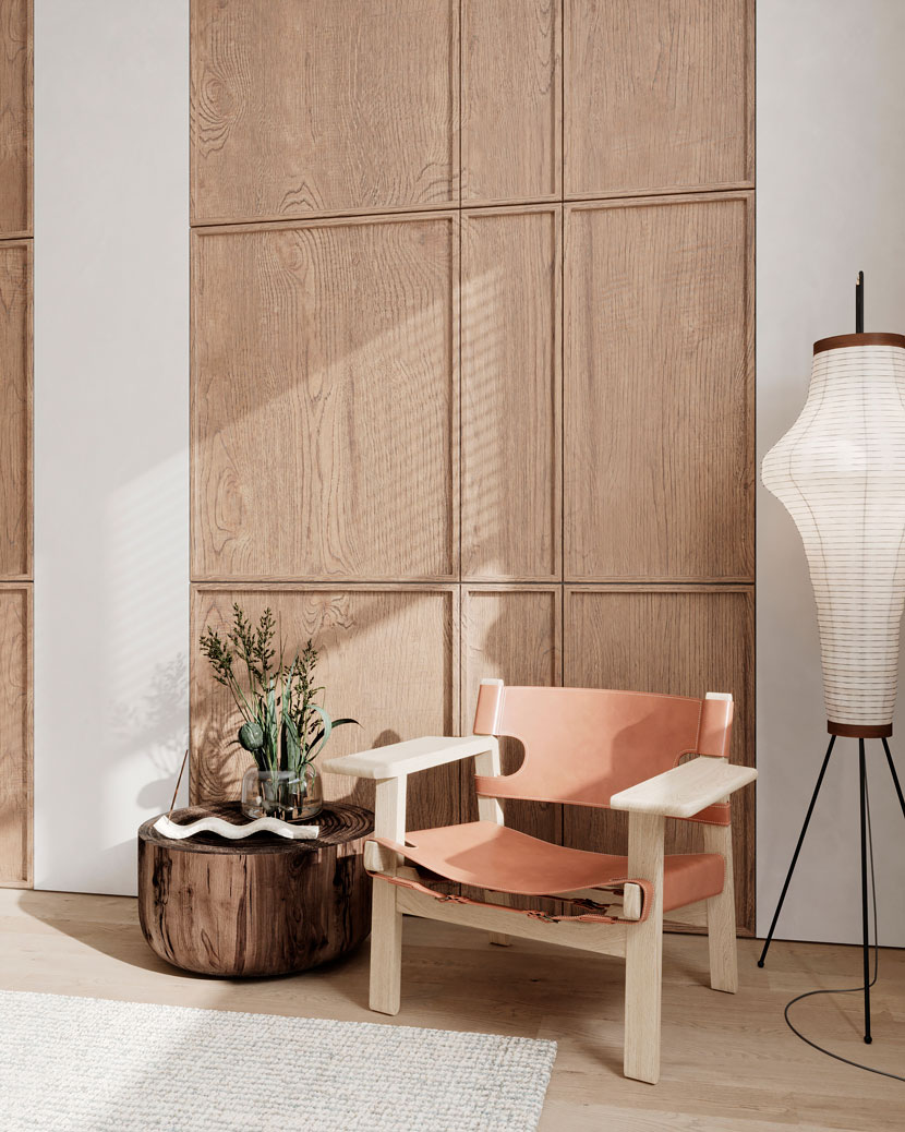
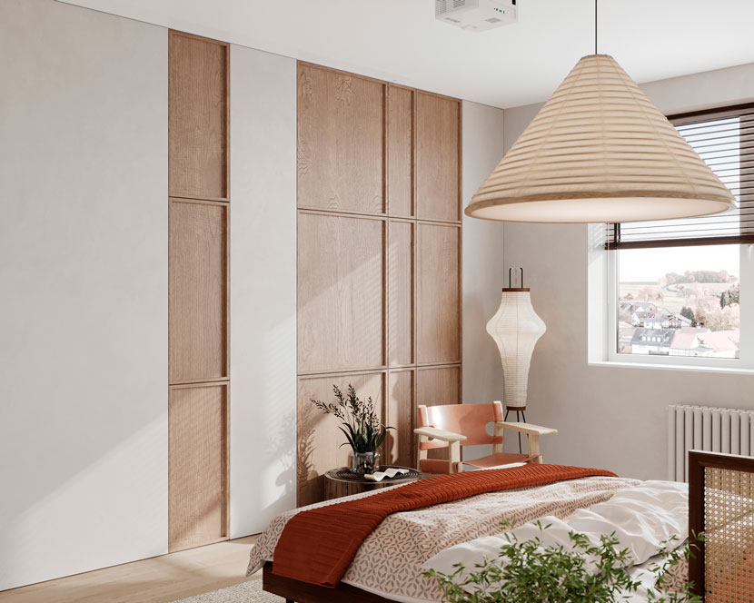
Thanks to everyone for reading my 'Making-of', I hope you've found useful information. Thank you to RebusFarm for giving me the opportunity to share my knowledge.
We thank Victoria for sharing her tips and tricks with our Rebus community. Check out more of her work with White Balance on their different channels:
Want to share your work with our community too?
Contact us at This email address is being protected from spambots. You need JavaScript enabled to view it.and tell us about your favorite project.
>> Read more articles on our blog
