
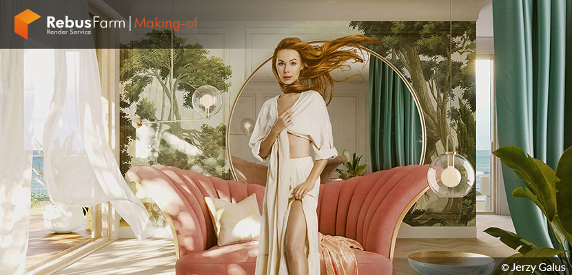
A project can become interesting and out of the daily routine when the client needs something special for its promotion. Jerzy Galus from VIZ.ART explains to us how after receiving a detailed brief from the client, this project turned out to be an enjoyable process!
About the artist.
Hi, everyone!
First of all, I would like to thank Rebusfarm for the opportunity to write an article about this work. I didn't expect such positive feedback on this project, so I will be delighted to write a couple of words about how it was prepared in this relatively short making-of article.
My name is Jerzy Galus and I'm an architect and ArchViz artist based in Kraków, Poland. I started in the architectural visualization field while studying Architecture and Urbanism at the Cracow University of Technology. It turned out that it was more than just visualizing my semestral projects, and I started working as a 3d visualizer in an office. Within a couple of years, after graduating with my diploma, I started my small studio - VIZ.ART. For the last couple of years, I'm also a part of M4G Seminars - a collective of 3d instructors who are connected by a passion for art and education.
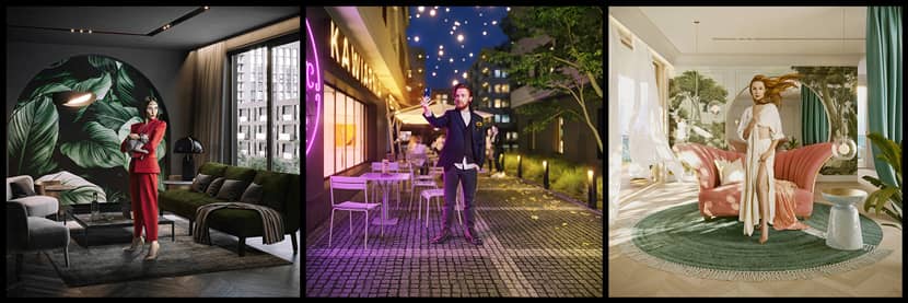
I want to write about one of our latest works prepared for Spravia, formerly known as Budimex, for their newest campaign across Poland. From one point of view, it was a regular interior and exterior set of images, but after receiving a bit more detailed brief from the client, it turned out we would have a lot of fun while preparing the job.
Paintings.
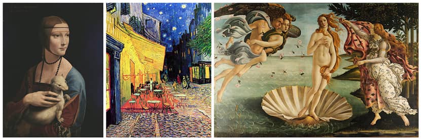
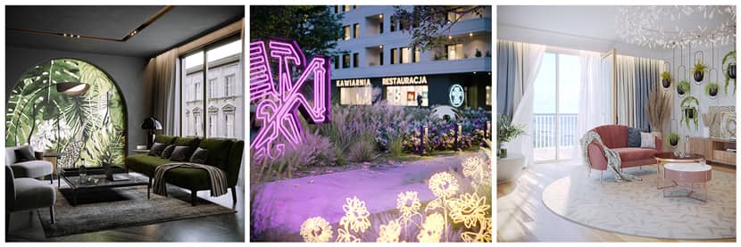
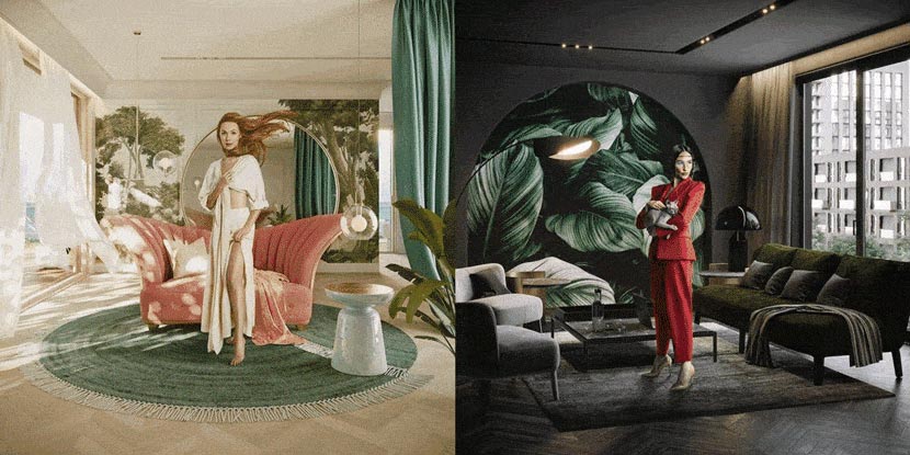
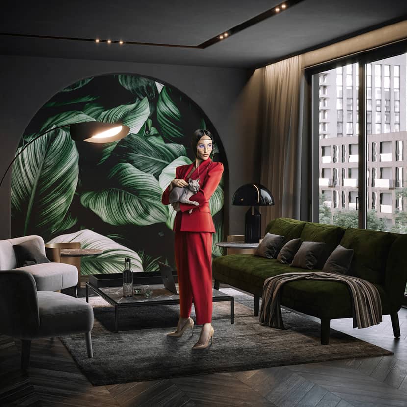
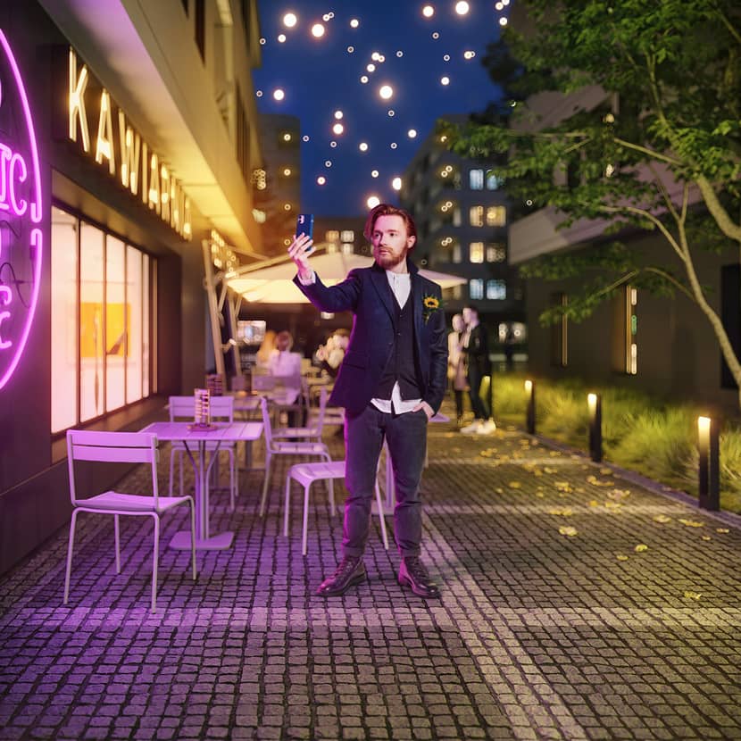
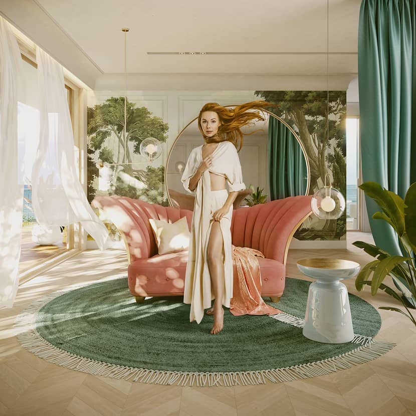
The clue was to prepare a scenography for the photographed models and gain the overall effect more modernly based on the milestones of painting. We have been given three artists with their three masterpieces:
- Lady with a Weasel by Leonardo da Vinci
- The Birth of Venus by Sandro Botticelli
- The Cafe Terrace on the Place du Forum by Vincent van Gogh
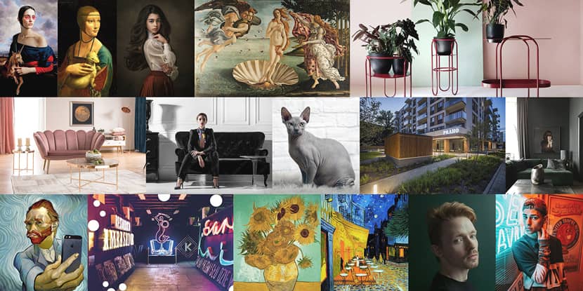
Moodboard.
Despite the general rule of recreation in these paintings, we also received helpful and straightforward mood boards with color palettes and additional direction, such as furniture, some interior props like colorful neons, fabric patterns, or specified indoor vegetation adequate for each painting.
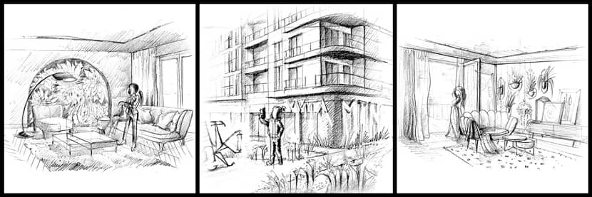
One of the principles was to set all images aspect at a 1:1 ratio to easily crop final images into vertical or horizontal orientation depending on the media it'll be used further during the marketing phase. At the very beginning, after being informed what's our goal, we started drawing some sketches. Yep, an old-school technique, which in this case, was fast and crucial to communicate with the client at a very early stage and to present some of our ideas before the modeling process. It also helped with an overall composition direction and general scope of work for each painting recreation.
Sketches.
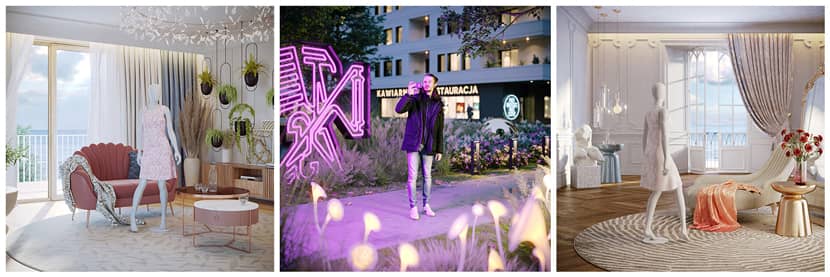
After the client’s initial acceptance, we moved into a CGI environment. We used 3D mannequins or 3D people to prepare the first drafts pretty quickly to catch general lighting and camera settings to recreate them as close as possible during the photo session with the actual models.
However, working more efficiently with sketches needed to use them as backplates inside the viewport. It won’t be perfect if - like in our case when we’re using a handmade sketch, but it’s helpful enough to catch each space’s approximate dimensions and set up a starting scale for each scene.
Screenshot.
We were looking for the right images during this process. And as it could be quite often, we needed to remodel 2 out of 3 shots from the basic set of images. Here are some examples of the previous versions before we did the most suitable one for the client. Happily, we found a solution, and the client was happy with the final result.
Click on the image to enlarge it.
Initial Renders.
Our software setup is pretty standard, including 3ds Max, Chaos Corona Renderer, and some very popular plugins, such as iToo Forest Pack Pro, Rail Clone from iToo Software. There’s nothing special here, really. For postproduction, we used a duo of Adobe Photoshop and Topaz Labs Studio 2 with its built-in Impression Filters to achieve a nice-looking painting effect as one of the options for the client. In terms of used assets, there’s also nothing sophisticated here with a set from Quixel, Poliigon, MaxTree, Design Connected, CGMOOD, etc. A simple FFD modifier is an absolute beast, and it was super helpful for the curtains to achieve a wind effect without using any simulation.
Modeling was a straightforward and enjoyable stage. I’m usually modeling everything as simple as it can be, starting from a box, remembering to respect depth, units, ergonomy, clean mesh, and avoiding gaps, especially along the primary structure like walls, ceilings, etc. It’s an old habit from the past with a common problem with light leaks in previous versions of V-Ray :)
Variations.
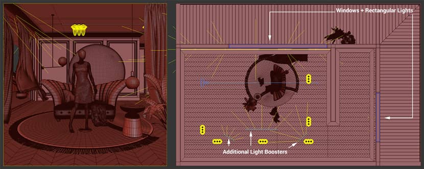
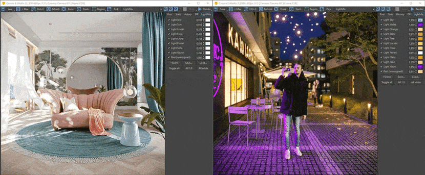
The next step was setting up the lighting and basic global shaders for items like walls and floors, checking where it would be good to place additional windows for reflecting purposes in visible items, etc. Besides the interior lights set up according to its sources, I used an HDRI with a subtle boost from Corona Sun and Corona Sun + Sky setup for the GI. I’m not usually testing the light on a synthetic override material unless the scene itself is complicated or the lighting needs to be more subtle. However, in this case, as new models were prepared or merged in every scene, their shaders were created, improved, or entirely changed into something more suitable without switching to the global material override option.
Timelapse.
Regarding shading, I enjoy Corona’s material maps/tools in everyday situations, such as UV Randomize, which helps a lot in cases like instanced objects or covering large areas without creating complex, layered materials. Corona Color Correct is the next handy tool built inside Corona, which I often use, also inside these scenes. It helps a lot with preparing variations of maps used in shaders without the need to prepare them outside the 3ds Max. In my opinion, it’s more intuitive and adjustable than Max’s native Color Correction. The third tool is Corona MultiMap, which, along with UV Randomize, allows us to variate shaders even more and works within a few clicks.
Here is an easy-to-understand tutorial on how this great feature works:
Lightmix.
If the scene doesn't need to be fully shown, as in this case - in multiple images or 360 panoramas, I often use additional lights to get some nice-looking reflections on glossy surfaces or to add more light - as in a regular photoshoot.
For this type of work or, in general, looking for nice lighting, I dig the Corona LightMix feature, which allows testing different light scenarios while an interactive render is going on. It's super handy to check multiple options and use them to create variations within just one render. It helped a lot, especially with the Vincent van Gogh scene. A pretty important thing to remember is that setting a plain white color of light sources in LightMix allows us to manipulate freely with color variations.
Models.
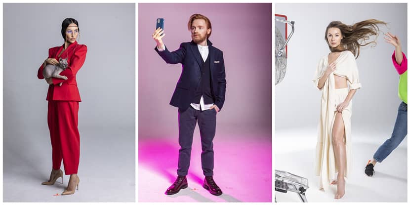
The last and final step for all these three images was postproduction. As I mentioned a bit earlier, it's just a basic Color Correction in Photoshop, and it was a bit more time-consuming getting rid of the background within the models actual photos. Placing them was slightly easier because the whole photoshoot was adjusted in terms of lightning accordingly to the alpha version visuals. I think most of us used 2d people at some point and know what's the drill ;)
The last thing was to emulate a painting effect. In this case, we used Topaz Labs Studio 2, which did an excellent job.
DA VINCI.
VAN GOGH.
BOTTICELLI.
It's been a great pleasure to share my work here and write a few words about how I prepared those shots. Thanks for reading!
With kind regards,
Jerzy Galus.
Check more of Jerzy's work on these channels:
Want to share your work with our community too?
Contact us at This email address is being protected from spambots. You need JavaScript enabled to view it. and tell us about your favorite project.