Monday, March 16th, 2020 by Julian Karsunky
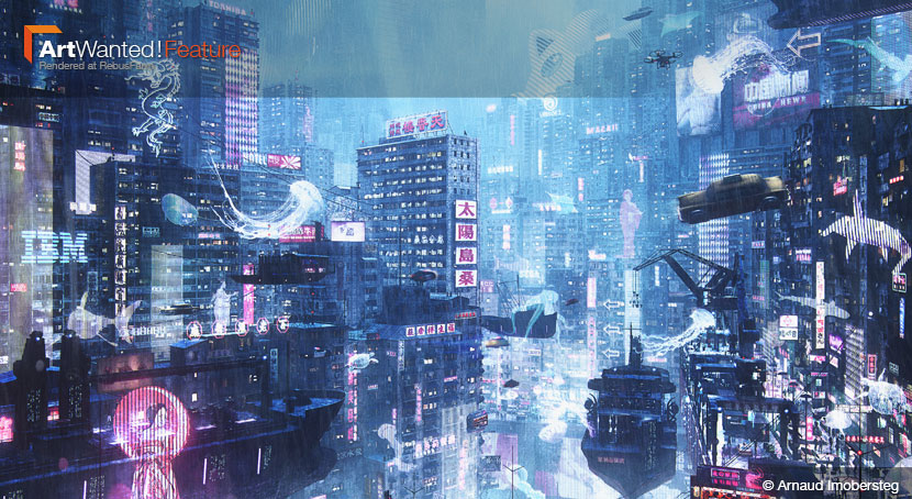
The best works of Science Fiction hold up a mirror to present day society. To condense this effect into a single image, achieved only through means of visual story-telling, is an ambitious task. Swiss archviz artist Arnaud Imobersteg did not shy away from the challenge, and created ‘Neo Kowloon’, a bustling cyberpunk city, in which the poor retreat to the rooftops to escape the overcrowded neon cityscape. His dystopian reimagining of the infamous Kowloon Walled City settlement of 1980s Hong Kong earned him a spot as finalist in the Cyberpunk #KB3Dcontest.
In our interview, Arnaud recalls how his understanding of archviz underwent a fundamental change, cyberpunk inspirations and walking the fine line between details and overstimulation.
 It’s easy getting lost in Arnaud Imobersteg’s ‘Neo Kowloon’ – you’re guaranteed to find something new with every look!
Hi Arnaud, thanks for joining us! To start things off, please introduce yourself to our readers!
Hello, I’m Arnaud Imobersteg, I’m a 28-years-old 3D and archviz artist from La Chaux-de-Fonds, in the French part of Switzerland.
What your first steps towards CGI?
I first discovered 3D while studying interior design at the Haute école d'art et de design, or HEAD for short in Geneva. It was there I first experienced software such as ARCHICAD, SketchUp, and form•Z. I liked it right from the start – giving life to architecture that eventually are constructed just through a couple key images on the screen has always fascinated me.
When did you then decide to pursuit a professional career as a 3D artist?
It was only after graduating that I realized making archviz images was actually a job. Soon, I started working at a small company called 3DM, specialized in contest images. We mostly used Blender, and over time, I learned a lot, establishing a proper basis of a complete 3D package for myself. Eventually, I realized industry standards required me to be proficient with other software as well. So, to further my skills and career, I started learning 3ds Max and V-Ray.
Later on, I moved to the Netherlands, where I joined Proloog, another archviz company focused on architecture tenders as. That was a huge change for me, as the projects were much bigger in scale than what I was used to. Suddenly, I was working on projects in Chinese cities and such.
After a year, upon my return to Switzerland, I linked up with Slashcube, where I currently work as a junior artist.
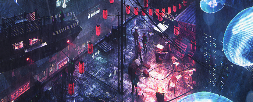 If not for the jellyfish and flying ship, this detail might depict a present-day scene. Arnaud worked hard to create a distinct, retro-futuristic look for ‘Neo Kowloon’.
Tell us more about your job and daily routine at Slashcube!
As my previous jobs, my current company is mainly focused on architectural competitions. Generally, this means tighter deadlines, less details and a heavier focus on the mood, more matte-painting techniques and similar shortcuts that speed up the process.
That said, from my experience so far, the process itself can differ greatly depending on the client and the scale of the project. When working for smaller architecture offices, usually you need to model everything yourself first before even thinking about rendering. Bigger clients, on the other hand, often provide a 3D model.
Working with the model includes placing it in a fitting environment and prepare everything so we can shoot previews and make sketches. Based upon the client’s feedback, we correct and refine the images further. Overall, it takes us around two weeks to create up to five images.
What inspires you as 3D artist?
Studying architecture felt like the logical choice at the time. I always liked drawing and photography, and from LEGO to Minecraft, I’ve always enjoyed building worlds. From there, getting into archviz was more or less inevitable.
However, my entire outlook of architecture and archviz changed the day I discovered Mir. Since then, I’ve been heavily influenced and inspired by concept art, by the likes of Thomas Dubois, Jama Jurabaev, and Simon Stahlenhag just to name a few.
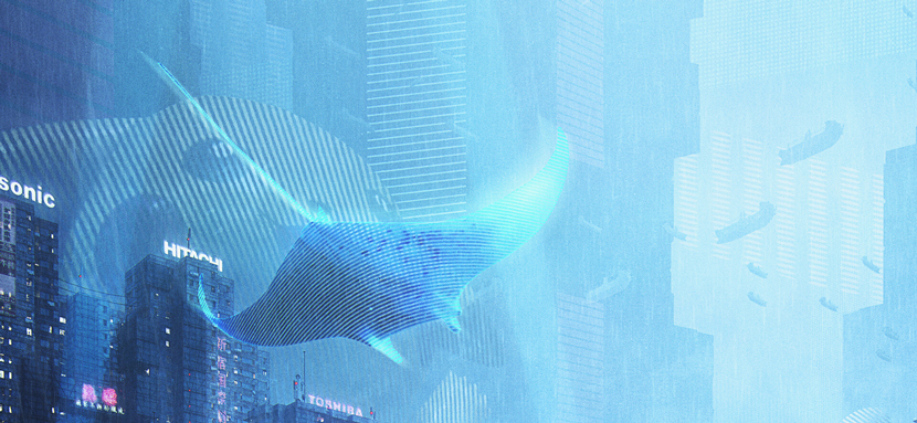 Between floating sea creatures, traditional Chinese junks and flying taxis, even the airways around ‘Neo Kowloon’ are heavily crowded. But wait, who’s that lurking in the background?
Let’s talk about your work in more detail, namely ‘Neo Kowloon’, a futuristic scene set in an Eastasian inspired metropolis and your submission to the Kitbash3D #KB3Dcontest: Cyberpunk competition. What initially motivated you to participate?
Contests like this one are always a chance to push yourself by stepping out of your comfort zone and trying new things. I also wanted to challenge myself, just to see whether I could handle a project with so many different layers and details.
The idea itself, a large, cyberpunk city has lingered in my mind for a long time, so this was the perfect opportunity to finally make it happen!
How would you describe your original idea?
From the beginning, I wanted to build an excessively crowded metropolis, so using the Kowloon settlement in Hong Kong as my main point of reference was a natural fit. Kowloon Walled City was infamous for its hyper-density, unregulated jurisdiction and thriving criminal underbelly before it was demolished in the 1990s. In my imagination, this perfectly meshed with my ideas of a dystopian, cyberpunk city.
‘Neo Kowloon’ is built upon many layers, that also reflects the separation of social classes. To relay this idea visually, I gave the background a more contemporary look, a stark contrast to the main area, which is but neither the nicest nor the richest part of the city.
How did you approach this project in terms of theme and aesthetics?
I always have been fascinated by depictions of large-scale cities, whether it’s drawings or CG images. The cyberpunk genre holds a special place in my heart, with ‘Ghost in the Shell’ and ‘Neuromancer’ being my favorite works. I had never made cyberpunk artwork myself, so I was eager to try my hands on it.
Instead of the same dark and narrow streets and back alleys often found in cyberpunk inspired art, I wanted to try something bigger. This is when I first came up with the idea of a main artery splitting the city in two parts. Adding the rooftop slums in the foreground came to me naturally. Following this idea, I built the background accordingly.
Once you had a rough concept in mind, how did you then go about realizing the idea? Can you briefly walk us through the development process step by step?
When I start a project, I usually take my time to think about it first, and gather lots of references. According to what I need, I then look for models and modify them to fit my intention. For this particular contest, things were a bit different, as the rules required me to make use of at least one of several premade kits.
Thankfully, the Kitbash buildings are pretty convenient in this regard, as they’re designed to fit specific themes and designs. For ‘Neo Kowloon’, I only used the slum kit, as I found the architecture to be the most fitting for my purpose.
Now, to get things started, I began by making several small renders to set the environment and push the 3D further. I worked on the composition to the point where I knew the placement of the main advertisements, the areas of main activity, as well as light sources such as the open fire on the rooftops.
The 3D base was built in 3ds Max and rendered in V-Ray. For postproduction, I first turned to Photoshop: I checked how I can enhance the render, then I correct or upgrade different elements accordingly. Next came the mattepainting work, I gathered the elements I wanted to use, loaded them in my scene and graded them to fit.
Finally, I reworked the whole image, paying special attention to the overall mood and atmosphere, matching the individual elements to create a coherent visual and homogenous feeling.
 |
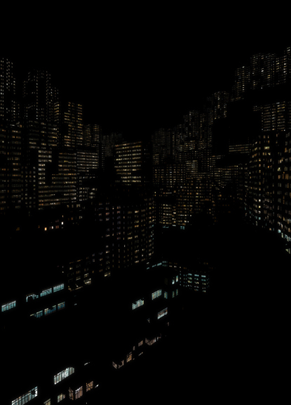 |
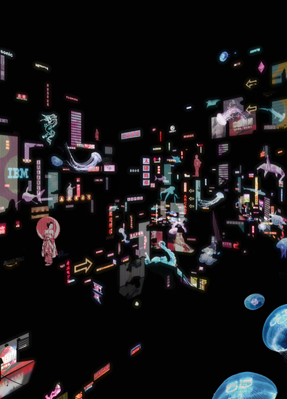
The hidden order in the chaos: these compositional drafts show the placement of billboards and buildings in ‘Neo Kowloon’.
There is a lot going on in the image! You put a lot of effort into details, some of which are only discernible by zooming in. Was overloading the scene ever a concern?
Usually, my personal taste is more in line with a minimalist approach. But my concept for ‘Neo Kowloon’ required me the overload the city with information, as I wanted to mirror the overstimulation I already see happening in our time. To accentuate this point further, I included some contemporary pop-culture references, which also makes for a nice, retro-futuristic look.
Hence, I intentionally put in so many layers, details, signs and advertisements that you have to zoom in to find out what’s going on. Including and handling all these details without making the image completely unreadable was the most challenging part of the project.
Generally speaking, how important are personal projects and competitions such as this one to you as a 3D artist?
To me, personal projects are crucial for artistic growth, either by developing and honing specific skills, exploring new approaches or just the freedom of creative expression in general.
What has your experience with RebusFarm been like so far? Is there anything you particularly like about our services?
The render farm is great, I’m definitely a fan! Being able to work on large scale projects without the need for a super-powerful workstation at home is simply amazing!
In closing, is there anything else you want to say? Any present or upcoming projects you’d like to mention?
I just want to thank RebusFarm for this opportunity and shoutout to your ArtWanted! campaign.
The pleasure is all ours! Arnaud, thank you so much for taking the time and all the best!
Keep up with Arnaud Imobersteg and his work here:
How to join ArtWanted!
You want to get featured in our ArtWanted! campaign and win 250 RenderPoints on top? Submit your work, rendered at RebusFarm, to 이 이메일 주소가 스팸봇으로부터 보호됩니다. 확인하려면 자바스크립트 활성화가 필요합니다.! Visit our Art Wanted! page for more information.
>> Read more articles on our blog
