Wednesday, October 6th, 2021 by Sivaraamakrishnan Gurusamy Muthupandian
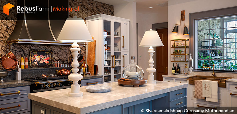
What a great opportunity to learn; the talented student, Sivaraamakrishnan Gurusamy Muthupandian, from the Gnomon School of Visual Effects, shares with us the process of one of his latest projects. Fresh, out-of-the-oven knowledge, put to writing by the artist himself, just for us. A detailed explanation of the astonishing re-creation of a beautiful kitchen photograph.
Sivaraamakrishnan gives us a tutorial on how he achieved such detail and similarity to the original photograph.
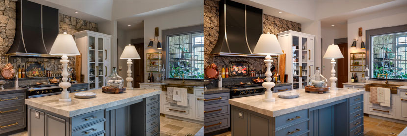 Original photograph and final re-creation, respectively.
Hello everyone, I am Sivaraamakrishnan Gurusamy Muthupandian, and I go by Siva. I am a student at Gnomon School of Visual effects, Games & Animation, pursuing a Bachelor of Fine Arts in Digital Production.
I switched my career from being a software engineer to a computer graphics student. I wanted to take my programming knowledge into the creative world of CG and I'm currently in my final year at Gnomon, specializing in Visual Effects.
In this 'Making-of' edition, I am going to break down the final project I did for the 'Intro to Maya class at Gnomon'. The goal of the project was to replicate an interior photograph as close as possible while utilizing all the robust tools of Maya for modeling, UV-ing, texturing, shading and rendering. And Photoshop for post-production.
Idea and inspiration
Since I was going to spend the next 7 to 8 weeks on this project, I wanted to pick a reference that was very pleasing to work on, considering the mood as well as the technical difficulties involved. I was looking for a reference that had several copies of the same object or objects, involving a similar modeling approach, glasses, bottles and lamps for example. Also, objects that had minimal to moderate modeling operations as this is an intro class that covers many aspects of Maya, not just modeling. Below are my initial picks.
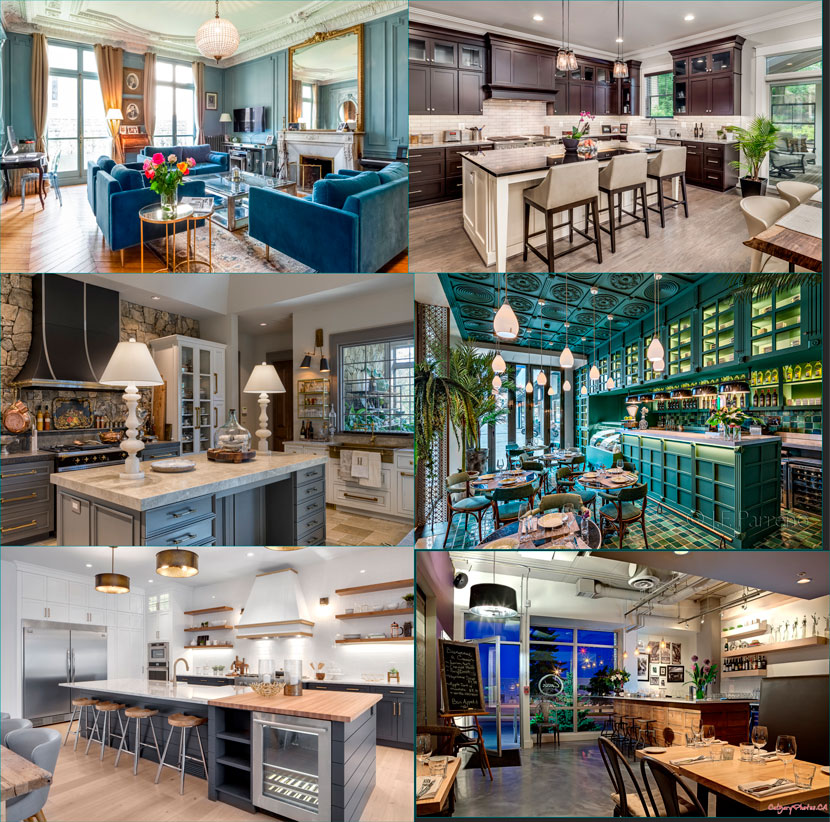 Initial photographic references before choosing the final re-creation project.
I chose the Kitchen by Tyner Construction, considering the color scheme, mood, composition and primitive shapes involved in the scene. Minimalistic, yet with complex looks.
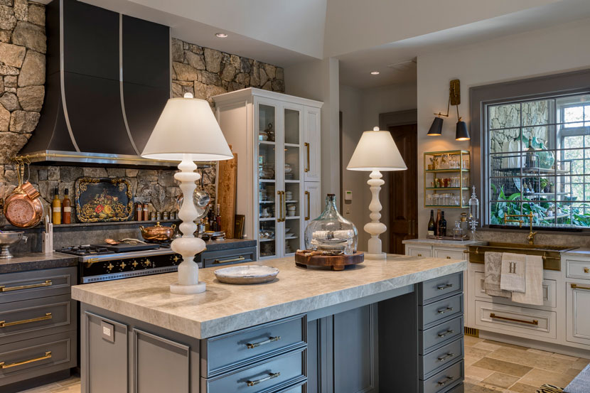 The Kitchen - photograph by Tyner Construction.
Modeling
I started off by blocking out the room, followed by the big shapes in the scene to match Maya's scene to the photograph. Gradually refined the shapes using simple modeling operations.
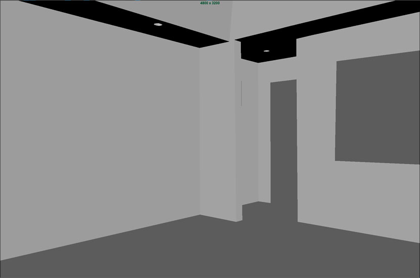 Modeling the kitchen's background.
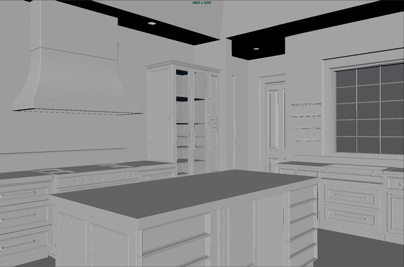 Modeling the kitchen's shelves and finishes.
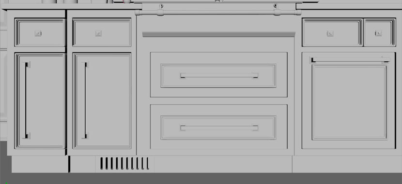 Detail on the kitchen's modeled finishes.
Layering in small objects into the scene, simple primitives such as cylinder, box and sphere were used to create all the objects in the scene. Utilizing NURBS wherever necessary to accelerate the modeling process. When the objects were in good shape, they were duplicated and placed as shown in the reference.

 Layering modeled and duplicated elements.
UV-ing
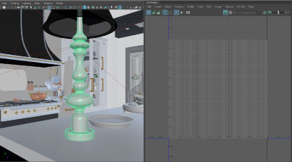
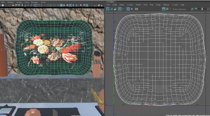
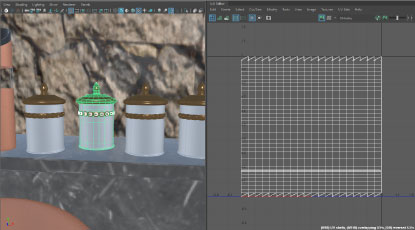
UV-ing was done with texturing in mind. Due to time constraints, and the goal of learning Maya LookDev workflow, almost all of texturing is done inside of Maya with the help of LookDev nodes (LookDev needs to be loaded via the plugin manager for the nodes to appear in the Hypershade browser) and PlaceTexture - 2D, 3D nodes. This workflow needs the UV to be straightened and normalized to fit 0 to 1 UV Layout as most of the objects are shaded using blend materials that require this UV layout for efficient masking and layering of textures.
NURBS objects come with a default UV layout. This is the style of UV layout we should aim for in other objects so that the PlaceTexture node's coverage parameter or ramps can make use of it efficiently. Simple objects have planar, cylindrical or spherical projection techniques followed by 'unfold', 'straighten' and 'normalize'.
 |
 |
 |
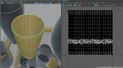 |
Texturing with LookDev Nodes and PlaceTexture in Maya.
This UV method helps in controlling the ramp that is used as a mask between chrome and bronze in a blend material or placing the texture map in the desired UV space using the coverage parameters. Other UV-ing, laying out techniques can be used as well based on the need of the object, if it requires complex texturing or to add decals using photoshop or substance.
Lighting
Lighting is crucial for realistic results, so real-world light sources from the photograph were emulated. The reference has scope for applying multiple lighting techniques in V-Ray, such as HDRI for the environment, 'sphere' for chandeliers, 'rectangle' for windows, 'bounce', and even 'spotlight' using its directionality feature with a V-Ray softbox or ramp in the texture slot.
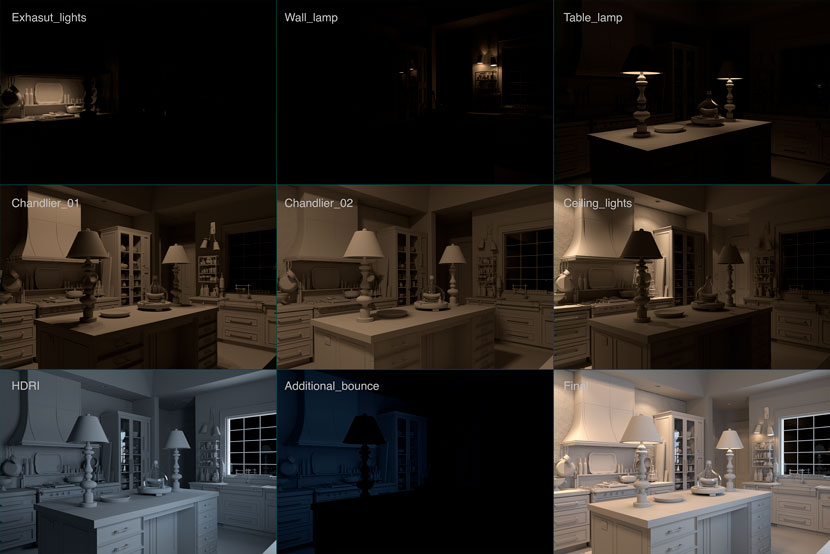 Different V-Ray lighting techniques.
IES lights create sharper shadows, enabling soft shadows might solve this issue. Attribute Spread Sheet can be used to modify attributes for any number of objects. Select all the IES lights and open the shape keyable tab in Attribute Spread Sheet. Then enter value 1 in the soft shadows column.
Texturing and shading
Most of the shaders used in this scene are basic V-Ray standard material, daisy-chained in V-Ray Blend Material if the object has multiple surface properties to it. This project helped me to explore and set up common surfaces like chrome, glass, bronze, copper, steel, marble, porcelain, wood and so on. V-Ray 2-sided material was used on the lamp to create translucency, V-Ray Bump material with Bercon Noise to emulate a rough surface on the cutting board and V-Ray Triplanar projection for the marble top. I utilized LookDev nodes such as 'color correct' and 'color composite' to modify incoming textures. The aim of the class was to explore as many elements inside Maya and V-Ray as possible.
As discussed in the UV-ing phase, the Place2DTexture node's parameters were modified for the texture to fit in a certain UV space for the desired result. This method was used to create labels for the bottle, decorative pieces for the glasses/plates, vessels with copper on the outside and steel on the inside. Below is a simple hypershade graph for a blend material.

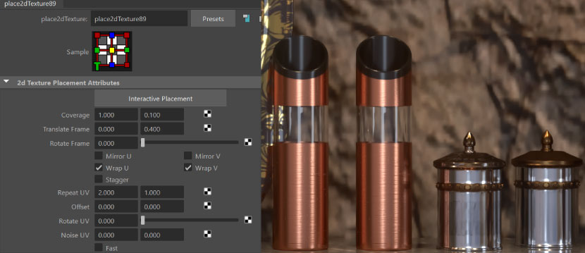
 Texturing and shading with V-Ray.
Simple nCloth effects were used to create the towels. For the sink towels, a plane edge was extruded in such a way that it is hanging over the bar and this object was made in nCloth and simulated with default settings. After the simulation, the object was extruded to create thickness. For the table cloth, a spiral curve was created and extruded lengthwise. Then, converted to polygons, it was all simulated as nCloth with little bend resistance, later extruded in thickness. If the construction history is lost for thickness extrusions, CTRL+Middle mouse button while in the 'translate' tool can be used on all faces to move them in their normal direction. This reduces or increases the thickness as required.
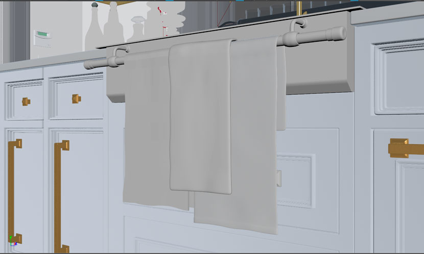 Texturing with nCloth tool.
Rendering
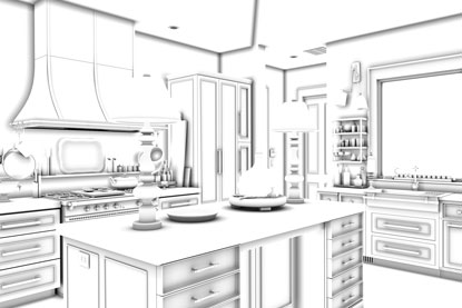
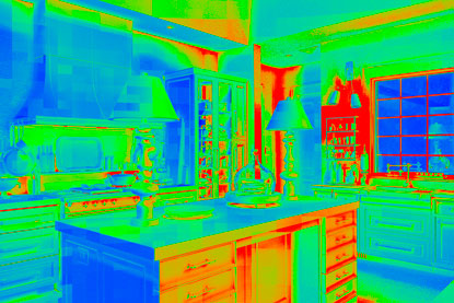
Render elements are very handy tools, not only for post-production but they are also very helpful in progressive rendering. Elements such as sample rate, reflection, GI, Lighting, etc. help to identify problematic areas and figure out what element in the render is causing noises or artifacts. By increasing the sampling subdivs, you resolve the respective artifacts. Rendering is always a battle between computing power and reasonable output. Having a little bit of noise helps to break the CG look, thus going too high on render settings is not recommended.
Window Glass material by default does not affect the alpha channel, thus compositing atop a background image is cumbersome, checking and enabling affect Color + Alpha needs to be ensured before doing the final render.
Ambient Occlusion pass – V-Ray dirt texture with default settings was used in V-Ray extra texture render element to create AO pass, which then was multiplied with Final image to create contrast in contact points.
Z-Depth pass – Z-Depth was used to create Depth of field in compositing. Light Select render element – this render element can be useful to increase/decrease light intensity. It creates a set in the outliner, where the lights can be dropped into. (with V-Ray 5, Light Mix render element can be used to get all the lights, and their FULL contribution into separate elements.)
 |
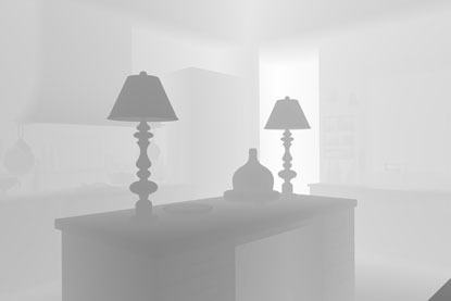 |
 |
 |
Post-production and rendering.
Compositing
Simple compositing techniques were used to improve certain areas of the render. Elements like reflection and refraction passes were added to enhance their effect. Z-Depth, as a new channel, was used in the lens blur tool to create depth of field and used curves to increase overall contrast. I added 'vignette' and little changes in camera raw filter parameters. Also, multiplied the AO pass to introduce contrast in occluded areas.
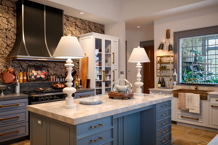 Final render. Re-creation of the kitchen's photograph.
Challenges and lessons
Viewport Subdivision or Render time Subdivision? - Since there are numerous objects in the scene, Viewport Subdivision tends to slow down the Viewport interactivity, making it impossible to move around the scene. V-Ray Subdivisions and displacement quality can be used to subdivide the geometry during render time, leaving the Viewport responsive.
IES Soft Shadows – IES lights create sharp, unrealistic shadows, enabling soft, proper and smooth shadows.
Color Mapping – also called Tone Mapping. To avoid bright hotspots/overexposed renders, Tone mapping in post is widely advised for greater control. But to get quick results and have a balanced exposure, the 'burn' value in Reinhard color mapping mode can be modified to get the desired results.
Memory Management – Huge scenes tend to take a toll on memory and loading the scene into V-Ray might feel like an eternity. By utilizing the Memory Tracking feature of V-Ray, we can identify the objects that consume more memory and optimize them so that the render loads without any issues.
We thank Siva for sharing his process and his learnings with our Rebus community. Check out more of his work on his different channels:
Want to share your work with our community too?
Contact us at 이 이메일 주소가 스팸봇으로부터 보호됩니다. 확인하려면 자바스크립트 활성화가 필요합니다.and tell us about your favorite project.
>> Read more articles on our blog
