Saturday, April 1st, 2017 by Julian Karsunky
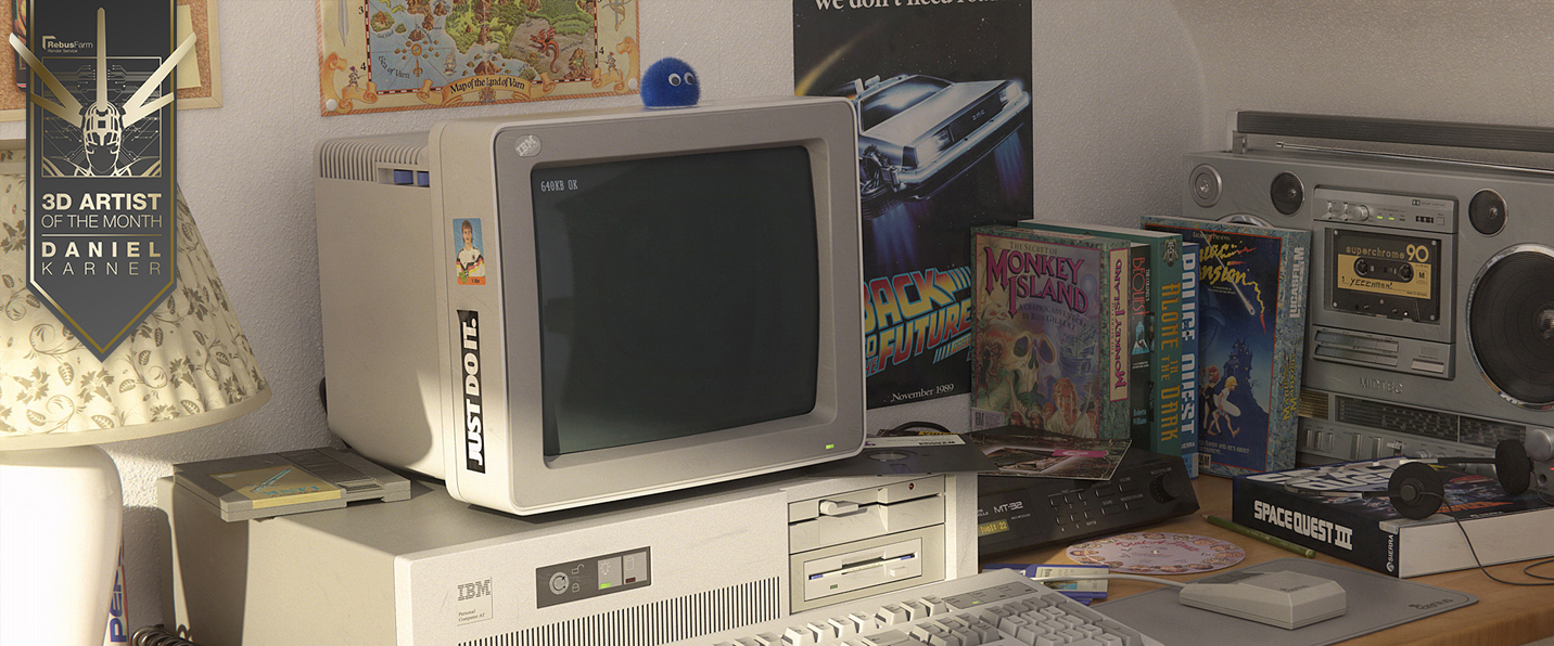
“Look behind you, a three-headed monkey!” No wait, it's actually Daniel Karner, our April 2017 3D Artist of the Month, taking us on a trip down memory lane. Titled “Back in 1991”, his winning image is an homage to the golden age of computer gaming, depicting a scene filled to the brim with memorabilia from the early nineties. The photorealistic imagery showcases stunning lighting and an expert understanding of compositing, while the amazing attention to detail is sure to make every geek of sufficient age squeal with nostalgic glee. Continue reading to learn more about the artist behind the image and for an in-depth making-of by Daniel Karner himself.
As Daniel tells us, “Back in 1991” actually is a throwback to his own past: “Growing up, I had this exact IBM-AT model with a PS/2 monitor, although I never owned that many games nor the MT-32 synthesizer.” Almost three decades later, Daniel's outstanding abilities as a 3D artist allowed him to finally bridge this gap and fulfill all of his childhood dreams.
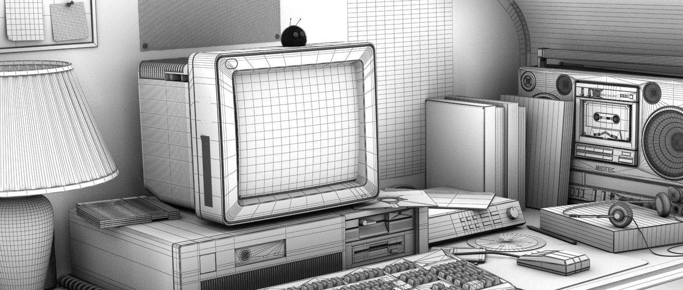
Back in 1991, Wireframe
Speaking of childhood memories, Daniel has been fascinated by special effects in movies for as long as he can remember: “As a kid, I used to create my own stop-motion short films with the Super8 camera I bought with my saved up allowance.” Years later, once again an experience at the movies was to have a lasting effect on Daniel. When he first saw DreamWorks Animation's Shrek at the theater in 2001, he was so impressed by its elaborate CG visuals that he decided to teach himself 3D. Before pursuing a career in the industry, Daniel had been working as an electrical engineer. An internship at Unexpected GmbH in Stuttgart gave the aspiring 3D artist an opportunity to improve his skills in modeling, shading, animating and compositing. In the following years, he started working freelance for various companies.
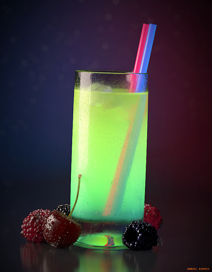
Daniel Karner's newest 3D still, modeled, shaded and rendered with 3DS MAX and V-Ray
As you might've guessed by looking at his winning image, our 3D Artist of the Month is a passionate gamer as well. When the opportunity to work in the gaming industry arose in 2011, Daniel gladly accepted. Today he is one of three 3D artists at German indie game studio Chasing Carrots KG, mainly working with Unity, Autodesk 3ds Max, Adobe Photoshop and SubstancePainter.
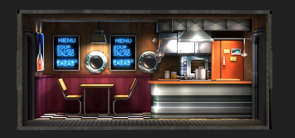
An in-game asset for "Cosmonautica", one of Chasing Carrots' delicious game creations.
Lighting and shading are Daniel’s favorite subjects in CG, as he's continuously intrigued by how different materials behave under varied lighting conditions. "Back in 1991" stands as a prime example of his skilled craftmanship in that regard. Currently, he's also very interested in real-time rendering: „Overall it's a great experience to roam both the offline and the real-time CG world“, Daniel says. In his spare time, he has been working on his own game prototype in Unreal Engine 4.
Scenes from the game prototype Daniel Karner is currently working on.
As Daniel hasn’t used our RebusFarm Render Service before, he's excited to render his upcoming projects using the free RenderPoints awarded for winning Artist of the Month. Congratulations from the whole team at Rebus and a very special thanks for taking the time to provide the amazingly insightful making-of below.
The Making-of "Back in 1991"
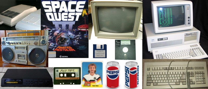
I started by searching the web for all sorts of things a young teenager could have had in his room in the early nineties, focusing on computers, posters, stickers and so on.
Nineties memorabilia found during research
Modeling and Layout
All modeling was done in 3ds Max without using subdivision surfaces. I modeled all objects in high poly so I had control over the polygon count and the chamfer edges of the objects. Correct chamfer edges were essential to achieve correct highlighting and make the rendering believable. With the exception of the keyboard, all assets were modeled by myself.
I also reused some assets from previous projects of mine and placed them off camera to fill the room because I wanted to avoid using an HDRI for reflections. So everything you see reflected in the objects on the desk is really there! This also gave the Global Illumination calculation something to "bounce" off.
The layout of the scene and camera didn't take that much time because I wanted to recreate the feeling of an amateurish photo and subsequently didn't care too much about cutting off objects nor the rule of thirds. I ended up using V-RayPhysicalCamera with a focal length of 75mm.
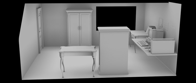
Side view of the scene with the desk on the right side
Lighting
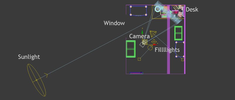
The main idea was to achieve a warm mood, so I wanted sunlight falling through the window and onto the desk. I achieved this effect by placing a V-Ray sun just outside the scene. While in theory, the sun should be the only light to illuminate the scene, it's rather tricky to get perfect lighting with just one light source even with Global Illumination in use. That’s why I used a Point Light with slight blue saturation to further brighten up the scene as well as two spotlights to illuminate the other side of the room. This was crucial as it meant Global Illumination got extra light to prevent dark spots and splotches. I used a linear workflow with Gamma 2.2 and a camera setup with F-Stop 4.0 and a Shutter Speed of 1/200 sec.
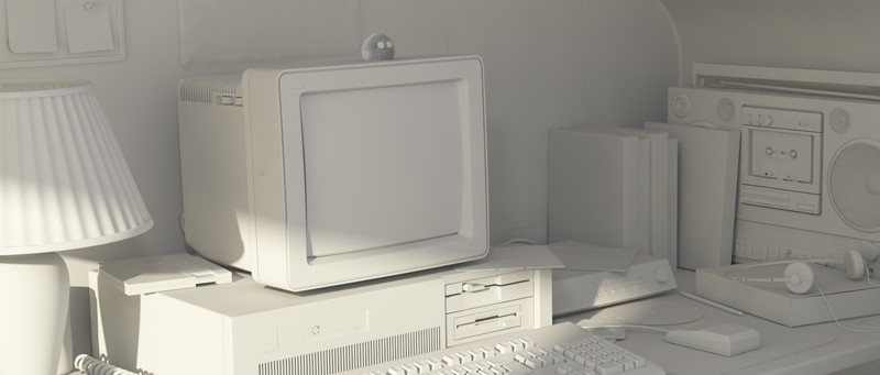
Final lighting without textures
Top down sketch of the scene showcasing the different light sources.
Shading
Since people frequently ask me how to achieve a realistic look, I want to take a minute and go into detail. First of all, I created the material with the diffuse color/texture and more or less "guessed" the right amount of reflection and glossiness. Then I did a quick region render of the shaded object to check the material. Most artists tend to oversaturate their colors, textures, and highlights, which ultimately makes the material look artificial. So I adjusted the color and saturation and did a quick render again.
I repeated the same workflow with the material's reflection and glossiness until the material had the right look. This workflow might sound simple and not too effective but it helped me to get a proper feeling for colors and reflectivity of the different materials. To get a gritty look I also used hand painted dirt maps on some elements. I did these black and white textures in Photoshop and multiplied them by an amount of about 10-20% over the specific texture.
I created more than half of the textures from scratch because I just couldn't find any suitable textures for some objects like the midi module or the cassette. All textures had a minimum resolution of 512x512 while the resolution of specific textures was up to 4K to preserve as much detail as possible.
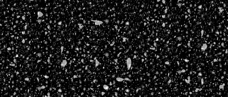
Last but not least I had to create a believable displacement texture for the wallpaper. To avoid texture tiling I ended up mixing a texture with a procedural map. Getting the right look for the displacement map was challenging because the flakes needed very specific proportions between them.
Detail of the wallpaper displacement texture
Rendering
To speed up the process and save memory, I first calculated the Global Illumination/Irradiance Map with displacement turned off. I then activated displacement and used the stored Irradiance Map for the final rendering. I also rendered some RGB masks and some render elements like 'Reflection' for compositing.
Compositing
After some minor Gamma corrections, I added a little glow in Photoshop to achieve an atmosphere illuminated by the sunbeams. Next, I inserted additional dirt into the image, which I painted directly onto a new Photoshop layer using a pen tablet. Using the RGB masks I separated some elements and made small hue corrections. Then I painted seams on the wallpaper and added a little grain to the image and used the reflection pass to enhance some reflections.
Finally, I slightly decreased the contrast and inserted some lens distortions to get the look of an aged and faded image.
HOW TO JOIN OUR MONTHLY CONTEST
You want to be our next featured 3D Artist of the Month during the upcoming month and be interviewed, featured on social media, in banners and even win 250 RenderPoints? Just visit our 3D Artist of the Month competition page and submit your entry. We'll choose the best image and contact the winner.

