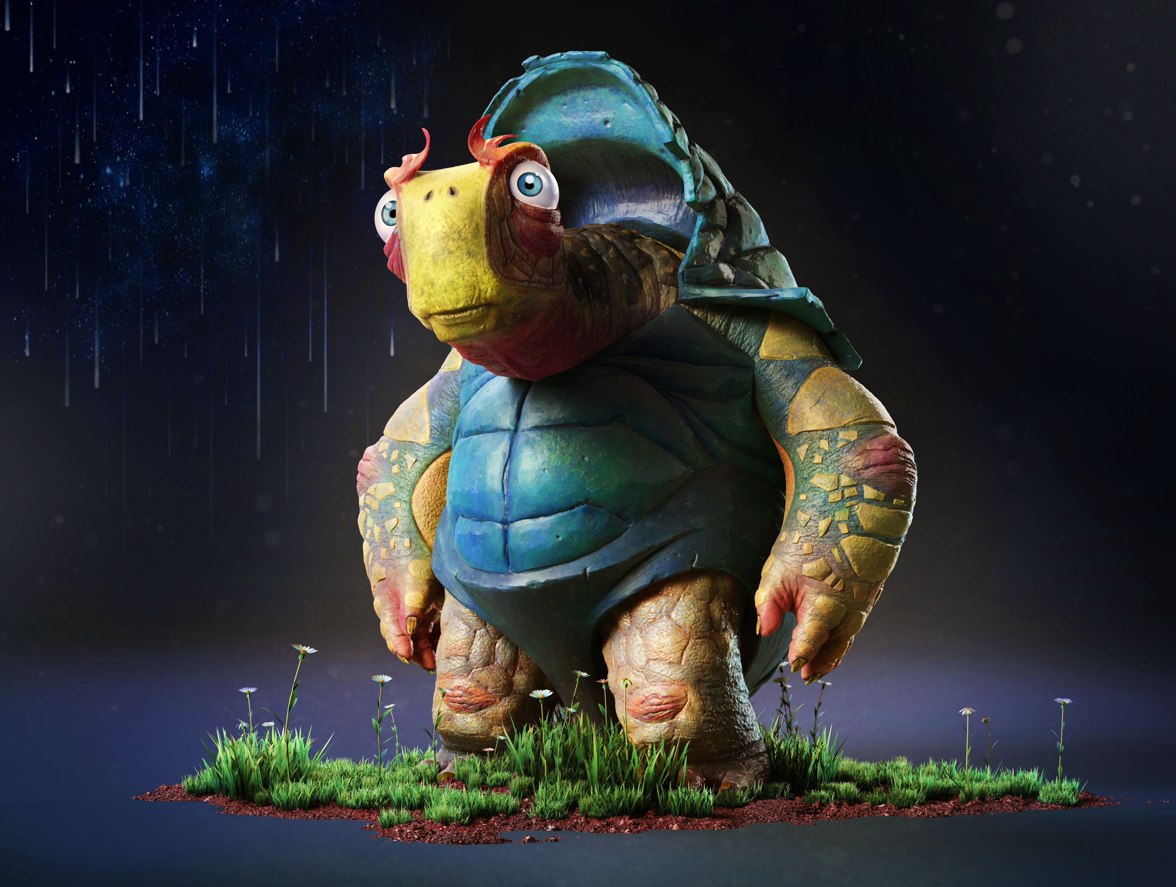
Friday, April 28th, 2017 by Milivoj Popovic
When we asked Milivoj Popovic, the RebusFarm May 2017 3D Artist of the Month, whether he wanted to do a piece detailing the development process of his winning image, we were hoping for additional work in progress pictures to go along with our regular interview. Surpassing even our wildest expectations, Milivoj went above and beyond to provide our readers with an exclusive making-of, jam-packed with insider tips from the artist himself.
Make sure to read up on our interview with Milivoj here. Now without further ado, RebusFarm is proud to present The Making of ‘Turtago’.
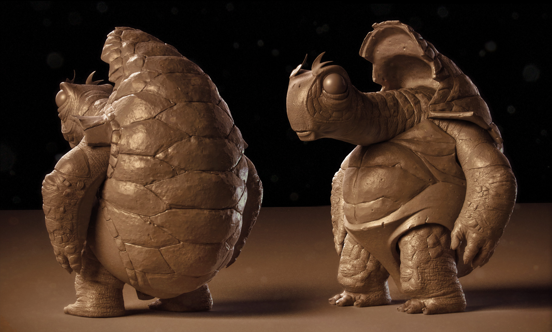
Clay rendering of ‘Turtago’
Step 1: Base Mesh
It’s really important to study the concept art closely. I try to understand the visual language and break down the forms that make up the image into their simplest shape: box, ball, tube and so on. Once I have a clear understanding of the drawing and its composition I move into Zbrush. One of the most frightening things for an artist is a blank canvas! That is why I love using ZSpheres to quickly build up the base mesh. It is so much fun to play with the forms as you can get from nothing to something really fast.
Once I am happy with the ZSpheres, I generate the mesh using adaptive skin. Keep the resolution of the generated mesh as low as possible without losing form. Low poly meshes are much easier to manipulate and change later, and that is what we need at this point.
For easier management, I split the mesh into logical sub tools. Now it's time to tackle each of those segments!

Creating the base mesh using ZSpheres
Step 2: Head Modeling
ZSphere topology is never great, but it’s good enough to start establishing the basic form of the head. Don't get lost in the details at this stage, this step is all about hitting those big landmarks!
When I get the basic shape I always do retopology. This way I don't have to fight with the edges to get the desired shape. I prefer using Modo as it has great retopo tools. The only thing I look for in retopo is edge flow – getting edges where the surface changes form. This allows me to get the shape precisely the way I want it. You can do this while still maintaining a low poly count, which, again, makes it so much easier to apply major changes later.
Once I am happy with the major shapes I start adding details, building smaller forms in Zbrush one subdivision at a time. It’s very important not to rush this process. Stay in subdiv level 2 as long as you can. Then once you’re happy with what you got, add another subdiv level and do the same. This way, you’re always in control of your sculpt and able to immediately address potential issues.
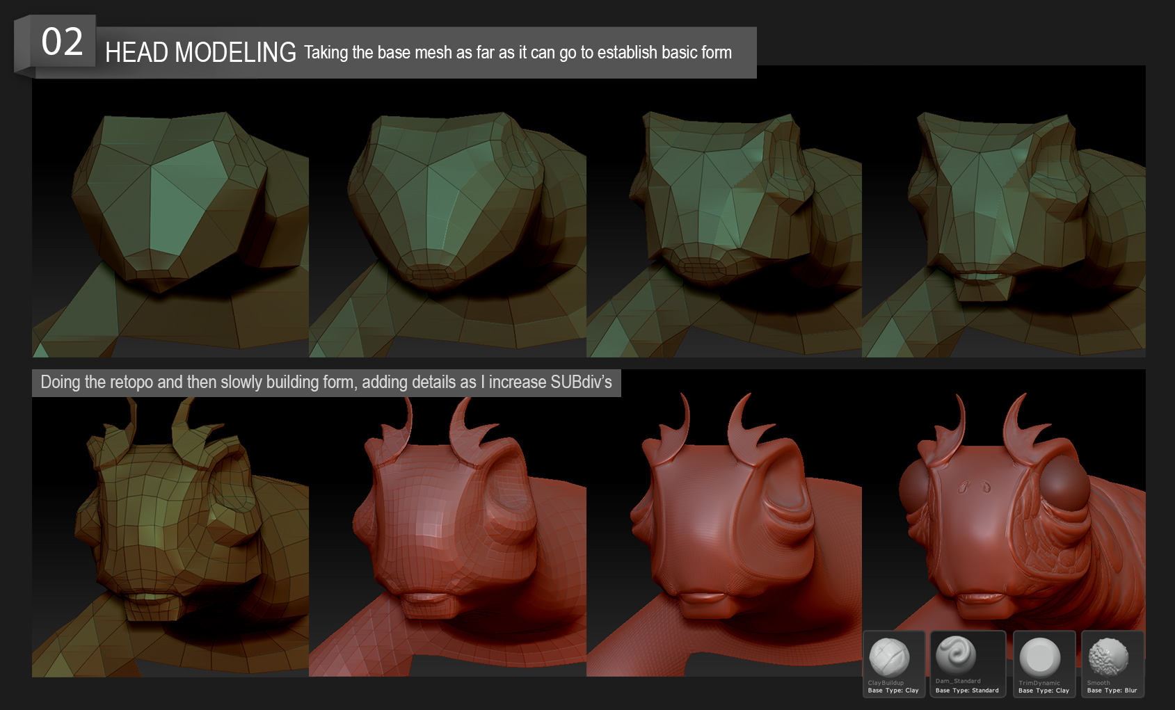
Establishing basic form, retopology and adding details
Step 3: Hand Modeling
Same process as with the head. I get the basic shape and then do the retopo and start refining the shape as I slowly increase the subdivs.
An important thing to look out for is the surface itself. Use details to highlight how one surface differs from the other: Is it hard or soft? Does it fold? Make this clear and your sculpt will look great.
I use basic brushes most of the time: Standard for softer skin, TrimDynamic for harder parts. There are so many tools and options in Zbrush and that's what makes it great. While I enjoy experimenting with new techniques, in my experience the most simple and basic tool will do the job just fine.
Saving masks is a great feature! It allows you to quickly draw out areas that you want work on separately and later come back to that setup with a single click. This was especially useful for this project as the interplay between soft and hard surfaces was essential for the sculpt!
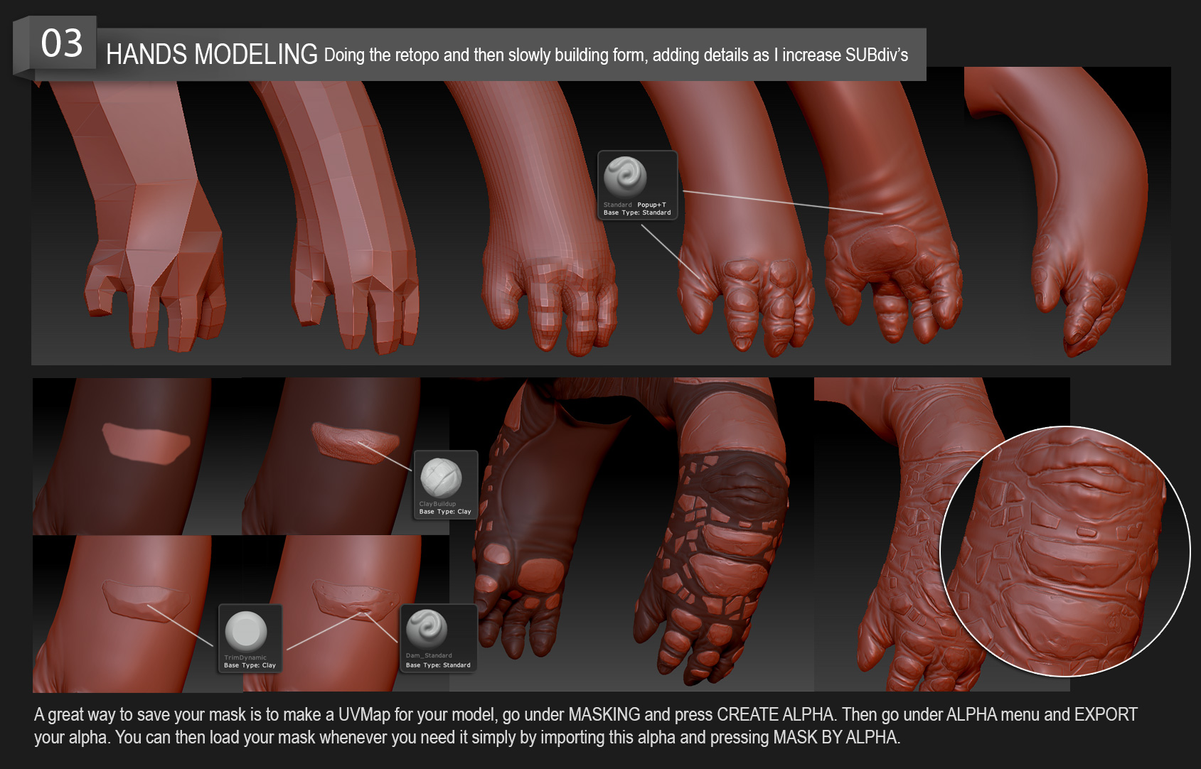
Tackling the hands! Usings masks, differentiating hard parts and soft parts of the skin.
Step 4: Shell Modeling
The shell is all about those transitions between surfaces and shapes. I really took advantage of retopology here, using carefully thought out edge loops to clearly define each shape. In combination with the Crease PG option in Zbrush I very quickly get a nice, clean model. Crease PG is such a great option and a life saver when you need to make and define a sharp edge!
A great way to design parts of a character is to draw the design directly onto the model using PolyPaint. This allows you to change the design around and see what looks right on the model. I use the drawing as a guide when building up that design in geometry. I discovered this method a couple of years ago while watching Daniel Bystedt's sci-fi character workshop. I highly recommend it!
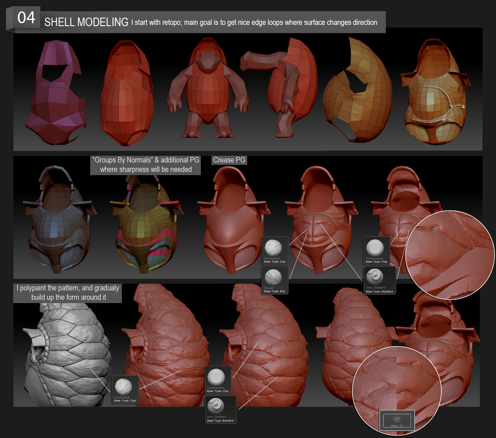
Defining shapes and surface changes, designing with PolyPaint.
Step 5: Legs Modeling
Getting the character of the shape in the lowest subdivision is the most important thing when modeling the different body parts. If you get this right, everything else folds into place much easier. Once the knee and the bend of the leg were there, the rest was easy.
I used masking to draw out the pattern which I made with Clay Build Up and refined it with TrimDynamic and Dam Standard. Notice the contrast between the soft and hard surfaces.
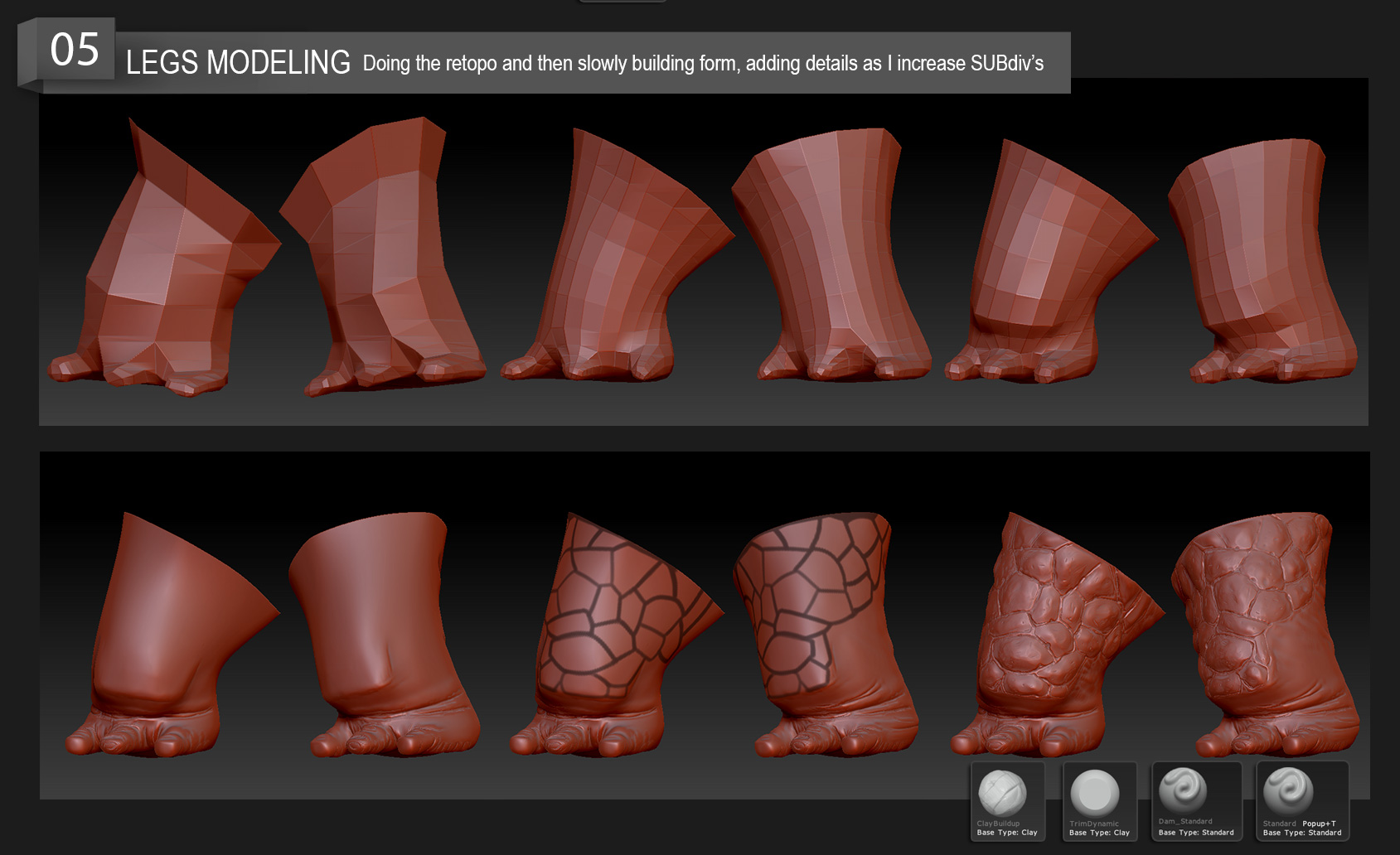
Getting the character of the shape in the lowest subdivision is the most important thing.
Step 6: Surface Detailing
This is where we further define surfaces of our model and also give it more life. What is his skin like: smooth, scaly, rough? These nuances tell a story and help "selling" our character to the viewer. They speak of the way his body moves, where he lives, how old he is and so on. Breaking up the surface also makes it more interesting aesthetically.
Now we take full advantage of saving masks: With the click of a button I can easily use one set of alphas and brushes for the hard parts of the skin and another for the softer parts.
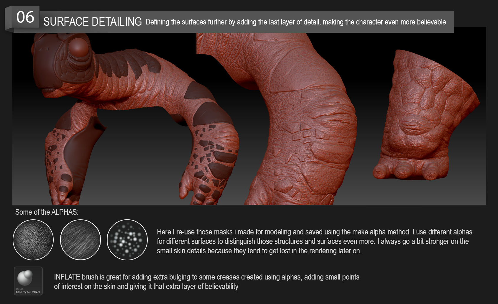
Bringing the skin to life, adding the final layer that supports the story of our character.
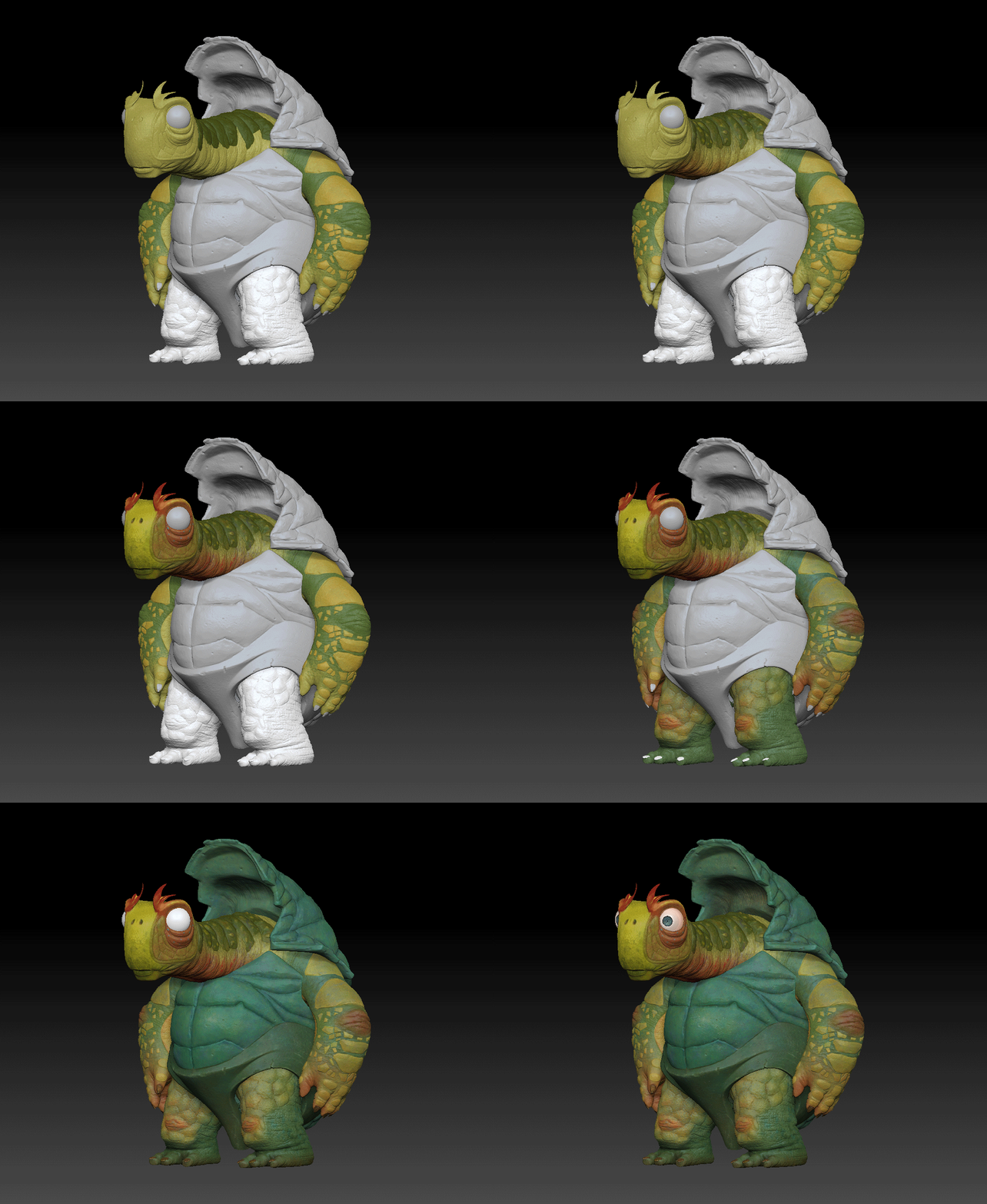
Polypainting the model
Step 7: Clay render
For rendering, I switched to Lightwave 3D. As mentioned before, the best solution is often the simplest and that was definitely the case here: I used the basic 3 point light setup for lighting, working with blueish light for the fill light a slightly warmer, yellowish light for the main light.
The surface setup is also really simple. I gave it enough specular shine so that all the little details of the model pop out. This is where we the effort in the previous step really pays off!
Since most materials have a reflection on incidence angle in the real world (Fresnel reflection), I added a gradient on reflection to mirror that effect.
When compositing, small tweaks to brightness/contrast and color balance really go a long way!
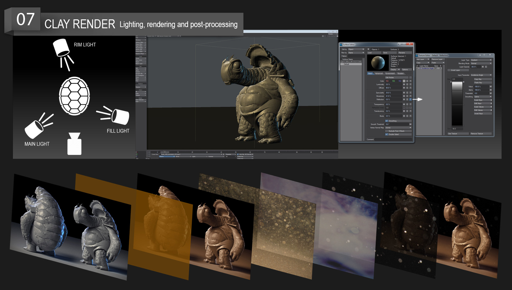
Getting the best possible render for your model.
Step 8: PolyPaint
I love using Zbrush for painting color maps! The following method is a great way to go about creating great color maps quickly and intuitively. On the technical side, I use the Standard brush set on stroke mode Spray, coupled with alpha ‘Alpha07’. To get a finer stroke, simply adjust Scale and Color in the Stroke tab.
As single color surfaces do not exist in the real world, variance in the color is key in achieving a realistic, organic look!
Artistically speaking, you want to build up your surface gradually. Start with a general base color over the whole surface and add variance and color changes according to the part of the surface you are focusing on. If the skin is thicker in that particular part, add a bit darker colors. If it's thinner, go towards the red spectrum, etc.
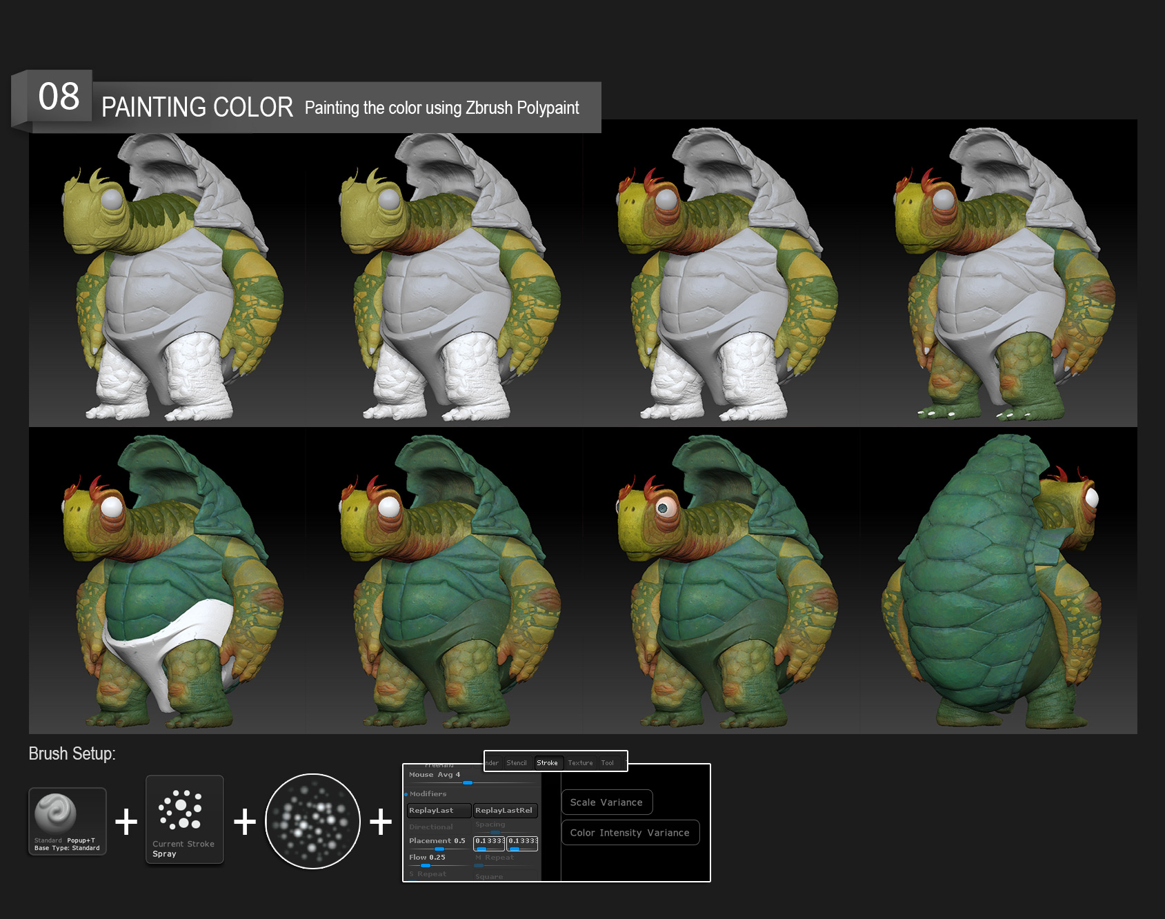
Taking our model from clay to skin.
Step 9: Final image
As with the clay render, I turn to Lightwave 3D, using the same 3 point light setup that worked so well for us before! We want to keep all the detailing visible while maintaining a clear contrast between light and shadow at the same time. This again is to accentuate the volumes of our model and provide additional atmosphere.
When rendering, I find it best to make separate surfaces for Color, SSS, specular and reflection. This way I have full control over the final result and can tweak all of those surface aspects individually. If I want something to stand out more, I change the lighting values and positions for those particular renders.
Rendering a "clown" pass is super useful because it allows you to quickly select different parts and surfaces of the model so you can tweak them individually.
Don't overdo it in compositing and remember to take breaks regularly so you can keep a fresh view.
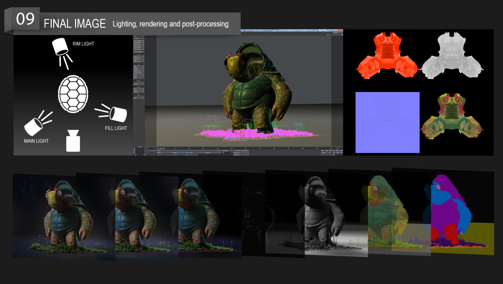
It´s all about surface, atmosphere, and light! Getting the best render helps to push the story we want to tell further.
We at RebusFarm would like to express our special thanks to Milivoj Popovic for sharing his extensive knowledge with our readers so willingly!
If you enjoyed this article, reach out to Milivoj and let him know:

